Unicorns, content and engagement flights of fancy

When you’re seeking influential content, engagement metrics such as a Facebook likes and LinkedIn shares are too simplistic. You need to know more about who engaged with it and why.

On the Road to Recap Venture Capital Community ReactionLast week venture capitalist Bill Gurley published a post called On the Road to Recap.

For anyone who doesn’t know, a Unicorn in this context is a startup company with a valuation in excess of $1bn.

The post analysed in depth the current investment situation in relation to Unicorns and concluded:

“The reason we are all in this mess is because of the excessive amounts of capital that have poured into the VC-backed startup market. This glut of capital has led to (1) record high burn rates, likely 5-10x those of the 1999 timeframe, (2) most companies operating far, far away from profitability, (3) excessively intense competition driven by access to said capital, (4) delayed or non-existent liquidity for employees and investors, and (5) the aforementioned solicitous fundraising practices. More money will not solve any of these problems — it will only contribute to them. The healthiest thing that could possibly happen is a dramatic increase in the real cost of capital and a return to an appreciation for sound business execution.”

The post lit a fire in the VC and startup communities.

In fact Lissted ranks the post as the most significant piece of content on any investment related topic in the VC community in the last two months. 

So I thought I’d see how it compares to other recent posts about Unicorns.

Comparison with other “Unicorn” content

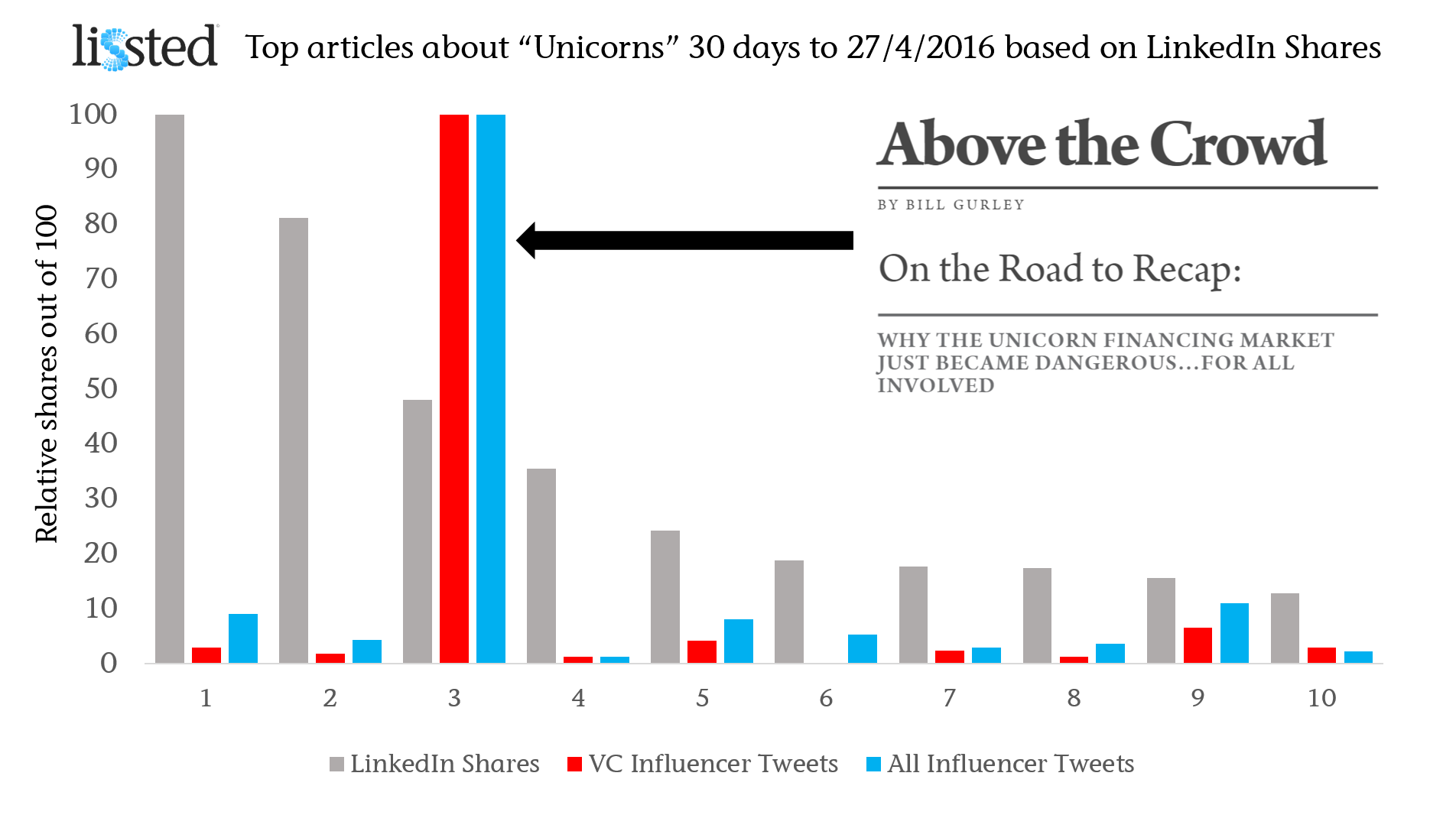
I searched across the last month for posts with the most shares on LinkedIn (URLs listed at the end). If you search across all platforms you end up with very different types of unicorn!

Having found the Top 10 articles on this basis, I then looked at the number of distinct members of Lissted‘s VC community on Twitter who shared each of the articles. The community tracks the tweets of over 1,500 of the most influential people and organisations in relation to venture capital and angel investment.

Finally for completeness I also looked at the number of distinct Lissted influencers from any community who tweeted a link to the piece.

In the graph the engagement numbers have been rebased for comparison, with the top ranking article for each measure being set to 100.

On the Road to Recap Venture Capital Community ReactionThe difference in reaction by the VC community and influential individuals in general is considerable.

15x more influential members of the VC community (169) shared ‘On the Road to Recap’ than the next highest article (11 -Topless dancers, champagne, and David Bowie: Inside the crash of London’s $2.7 billion unicorn Powa).

9x more influencers across all Lissted communities (419) shared the post (46 for the Powa piece).

VC Community reaction examples

Influential retweeters of Bill’s initial tweet above included Chris Sacca, Om Malik & Jessica Verrill.

Examples of key community influencers who tweeted their own views were:  

And people are still sharing it days later:  

Mythical measurement

So, the next time you set out to find influential content, don’t get too carried away with big engagement numbers. Focus on understanding where and who that engagement came from.

That way your conclusions will be legendarynot mythical.

If you’d like to get a daily digest of the influential content in the Venture Capital community, sign up for a free Lissted account here, then visit the Venture Capital page.

Lissted Venture capital page

Articles

1. Forget unicorns — Investors are looking for ‘cockroach’ startups now

2. What investors are really thinking when a unicorn startup implodes

3. On the Road to Recap: | Above the Crowd

4. Next Chapter: Cvent Acquired for $1.65 Billion

5. The fall of the unicorns brings a new dawn for water bears

6. Why Unicorns are struggling

7. Oracle just bought a 20-person company for $50 million

8. Silicon Valley startups are terrified by a new idea: profits

9. Topless dancers, champagne, and David Bowie: Inside the crash of London’s $2.7 billion unicorn Powa

10. 10 Startups That Could Beat a Possible Bubble Burst

UK journalists say social media more important than ever (the real story of Cision’s study)

Social journalism headlines

A survey by Cision has found that time spent using social media for work by the UK journalists who responded has fallen. The focus this finding has received is unfortunate as this reduction may simply be due to increased productivity. Meanwhile, for the first time the same survey found that a majority of UK journalists now think social media use for work is both necessary and beneficial.

Cision have produced their annual survey of how journalists are using social media. The top finding is a fall in the proportion of UK journalists using social media for work for four hours or more per day. The level has reduced from 24 per cent in 2012 to 13 per cent in 2014. The inference drawn is that we’ve reached a point of “saturation”, or even decline, in the use of social media by UK journalists.

The thing is, time spent is only relevant if you can relate it to a set objective. In this case the reduction in time seems most likely to me to be due to improved productivity in the use of social media by journalists.

Here are a few potential reasons for this:

– According to the survey, Twitter is the No.1 tool used by UK journalists (75 per cent). Our analysis of when UK journalists joined Twitter suggests they have had between three and six years to become proficient at it.

– Productivity tools are likely to be widely used by now, particularly by those who use social media the most. An example of this is in the survey where it highlights 25% of respondents saying they use Hootsuite.

– Knowledge from earlier adopters will have been shared with colleagues who joined later. Journalism.co.uk’s excellent newsrewired conferences are an example (the latest of which was yesterday).

Meanwhile the same survey also tells us:

– 54% of journalists who responded couldn’t carry out their work without social media (up from 43% in 2013 and 28% in 2012).

– 58% say social media has improved their productivity (up from 54% in 2013 and 39% in 2012).

If the survey is representative, this means a majority of UK journalists now think that the use of social media for work is both necessary and beneficial.

Isn’t this the real story?

1/3 of LinkedIn’s Trending Content articles in March were from the LinkedIn Publishing Platform

LinkedIn has launched a tool, LinkedIn Trending Content, that lets you see the content that has been shared the most by different sections of its community. The site is currently showing the most shared URLs between 1/3/14 and 22/3/14.

Its an interesting tool for identifying the articles, and related topics, that have generated the most reaction in different groups.

It also provides the basis for a few other observations:

LinkedIn Publishing Platform content ranks very highly

In three groups – Students, High-Tech and Health & Pharma – the top ranked article is one that has been published on LinkedIn’s own Publishing Platform.

8 out of the 10 groups have at least one LinkedIn article in their Top 15 and in the case of Students, C-Suite and Marketing more than half of the Top 15 are from LinkedIn.

Only the Automotive and Financial Services groups have no LinkedIn articles in the Top 15. An opportunity there for someone?

In total 49 out of the 150 results are from LinkedIn (there are a couple of duplicates in there). I haven’t had the time to count the results for all the other individual sources but a quick scan suggests that none of them have more than 10.

LinkedIn Articles in Trending Content

17 shares are enough to trend in Automotive

The table below shows the number of shares on LinkedIn as a whole that the articles ranked 1st and 15th (the lowest position shown) in each section have received.

LinkedIn Trends Industry comparison

I assume the tool’s ranking is based (sensibly) on shares by members of the specific section e.g. Health & Pharma, concerned. This explains the instances shown in orange – IT Decision Makers and Financial Services – where the 15th placed article has received more shares overall than the 1st placed.

This must be because less of their shares were within the specific section being evaluated e.g. the 15th ranked article in Financial Services must have received less than 47 of its 297 shares in this specific section or it would have to outrank the 1st article.

The interesting takeaway for me is that the more specific groups – High Tech, ITDM, Health &  Pharma, Automotive, Financial Services and VC (with the exception of Marketing) – all require less than 500 shares across the entirety of the 270million+ members in order to rank in the top 15. In Health & Pharma, VC and Automotive it’s less than 150.

In a measurement context therefore a piece of content in any of these areas that is receiving tens of shares would appear to be significant.

US content dominates

All of the top ranked articles are from US sources and a quick scan of the others in each section suggests this is the case across the board. No great surprise given that US members are the biggest group at around 30% of the total.

Articles checked for share stats

Students

1st How to Answer Stupid Job Interview Questions
15th
How To Become A Jedi Knight

C Suite

1st 18 Things Highly Creative People Do Differently
15th Confidence. Conviction. Charisma: The Art of the Sale. 

Small Business Owners
1st 18 Things Highly Creative People Do Differently
15th 5 Hashtag Tracking Tools for Twitter, Facebook and Beyond 

Marketing
1st Behind the Preplanned Oscar Selfie: Samsung’s Ad Strategy
15th 5 Business Goals of Content Marketing

High-Tech
1st Big Data: The 5 Vs Everyone Must Know
15th Is Microsoft telegraphing the demise of Windows Phone?

Health & Pharma
1st Saying Goodbye to the Old World of Healthcare
15th A Third Of Nursing Home Patients Harmed By Their Treatment

IT Decision Makers
1st How to Build Trust as a New IT Executive
15th 6 IT Strategies to Stay Ahead of Data Center Trends

VC
1st New York VC Investments Top $1B In The First Quarter
15th The Top Venture Capital Investors By Exit Activity – Which Firms See the Highest Share of IPOs?

Automotive
1st First Times Drive: 2015 Audi A3 e-tron plug-in hybrid
15th Hyundai Revamps Sonata That Upgraded Carmaker’s Image 

Financial Services
1st Employee’s Whole Life at-a-glance
15th Should I Rent My House If I Can’t Sell It?

Online readership analysis – is bigger better?

Following my post the other week regarding online readership, sparked by some aggressive sales tactics by one of our competitors, I got talking to Andrew Smith of Escherman and we agreed to jointly carry out a more extensive piece of analysis looking at 50 different online news sites.

We selected ten sites each from the following areas – UK Nationals, Business, Marketing, Technology and Consumer. There was no particular selection process, just an attempt to have a reasonably representative sample and we both hasten to state that this is a relatively limited exercise which should therefore be taken with at least a pinch of salt. Particularly since indexed urls have been used as a proxy for content as this can be impacted significantly by site structure (as stated in slide 21), with some sites having sub domains and/or a more complex content directory structure.

However at the same time with the data that is readily available we think it provides some (arguably) valuable food for thought. So after several hours of research, number crunching and graph generation here are the results (I suggest you view in full screen mode unless you have excellent eyesight):

Site data is sourced from Google for the number of indexed urls via the “site:domain” command and from AdPlanner for the traffic data.

We are effectively looking at three areas:

Readership per article – average numbers of UK page views per Google indexed url per month. Where indexed url is a proxy for the number of likely visited pieces of content.
Engagement – time spent per page to indicate how long a reader is likely to be spending reading that content when they get there.
UK Relevance – what proportion of the sites readers as a whole come from the UK and would therefore be likely to be relevant if you were trying to reach a UK audience.
Andrew has provided his take on the results from a PR perspective here. For my part the highlights are:
Readership
Unsurprisingly readership per article is much higher for UK Nationals and Consumer than the sector specific publications. However within the performance of UK Nationals and Consumer a handful of sites stood out for having particularly high UK traffic per article being, in order, News of the World, Heat, The Sun, The Mail, Closer Online and Marie Claire.
Interestingly though if you remove these six high scoring sites from the samples then the sector specific sites still achieve, on average, between 30-60% of the readership per article of the remaining UK Nationals or Consumer titles.
Within the sector specific titles there were equally some significant differences in results with Techcrunch Europe, The Register and T3 being at the top end in views per url in Technology; Marketing Week and NMA in Marketing; and is4profit, Startups, Businesszone and Real Business above the average in the Business group.
Engagement
The top six engagement scores were achieved, in order, by Reuters UK, Information Age, Financial Times, Business Zone, The Independent and The Register. A very different result to the readership per url figures.
This difference was further underlined with the Business and Technology sites achieving on average approximately twice the time spent as Consumer sites. Evidence for both more in depth content and greater engagement, which doesn’t seem surprising.
Relevance
There are significant differences within each group with regards to proportion of UK traffic. Within UK Nationals the tabloids are generally between 60-75% UK based with the qualities between 30-55%; the FT having the lowest UK traffic proportion with 31%.
Within Business titles the vast majority of sites are UK focussed and because of this their audiences are predominantly UK based also. The exception being The Economist with only 7% of its audience being from the UK according to AdPlanner. Interestingly this seems to reflect the broad geographical interest of its content with even the US only accounting for just over a third of its traffic.
Its a similar picture within the Marketing titles with the vast majority of traffic to the sites selected being UK based. The marketing publication with the lowest UK proportion is Econsultancy with 57% from the UK. This in in part due to around 20% being from the US which seems consistent with their having a US presence.
Finally Technology and Consumer titles have quite varied levels of UK traffic with sites such as Techcrunch Europe and Vogue.co.uk (clearly having the potential for interest from outside the UK) having lower proportions of UK traffic at around 20-40% compared to sites such as T3 and Heat which are between 75-100%.
Conclusions
Though limited the analysis provides evidence for savvy PR people who already know that it is important to ensure that you understand the publications they engage with and their potential to actually reach the readers and communities most relevant to them and their clients and not be blinded by big traffic numbers.
There are many other points that could be drawn out of the results and we would love to get feedback from people on anything they observe or suggestions as to how to refine the analysis and improve the validity of the results.
Notes
The other publications analysed not mentioned above were:
UK Nationals
Business
Marketing
Technology
Consumer

Am I talking to myself? TweetReach may have the answer

I’ve been rather busy lately moving house, hence the lack of posts and even a reduction in my Twitter activity. To get back in the swing of things a quick post about TweetReach.

Stephen Waddington highlighted this tool to me at the North East CIPR Awards on Friday (congrats to all the winners by the way).  It is pretty straightforward to use.  Put in a term, a url or hashtag and it calculates the following three measures:

Reach – the number of different people who follow people who have talked about the search in some way.

Exposure – how many times someone could have seen a particular reference to the topic e.g. if 4 people have tweeted it who all have a follower in common then that follower will have been exposed to it 4 times but will only count as 1 in the reach figures.

Impressions – the total number of occasions to see (effectively the sum of the “Exposure” figures for everyone “Reach”ed)

Note that the Reach figure measures the number of different people. Assuming this is the case (and I have no practical way of checking this) then this is good stuff as it ensures that duplication in networks is taken care of. It also tells you what proportion of the relevant tweets were retweets or @replies.

So a very good tool in theory for understanding the extent and likely penetration of a conversation. However unfortunately the bad news is that it is limited to the last 50 tweets, unless you pay TweetReach $20 and even then it is limited by Twitter’s API to the last seven days or 1,500 tweets. The seven day limitation also means that you MUST carry out the analysis close to the time of the relevant conversation as you can’t go back historically. These factors weaken its role as a measurement tool significantly unfortunately IMHO.

Perhaps now that Google are indexing our tweets the tool could be expanded?