1/3 of LinkedIn’s Trending Content articles in March were from the LinkedIn Publishing Platform

LinkedIn has launched a tool, LinkedIn Trending Content, that lets you see the content that has been shared the most by different sections of its community. The site is currently showing the most shared URLs between 1/3/14 and 22/3/14.

Its an interesting tool for identifying the articles, and related topics, that have generated the most reaction in different groups.

It also provides the basis for a few other observations:

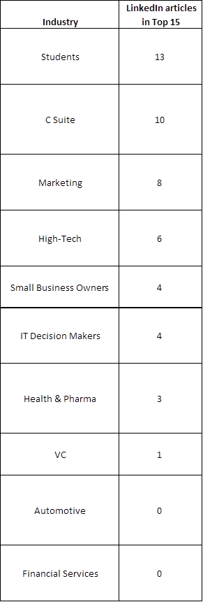
LinkedIn Publishing Platform content ranks very highly

In three groups – Students, High-Tech and Health & Pharma – the top ranked article is one that has been published on LinkedIn’s own Publishing Platform.

8 out of the 10 groups have at least one LinkedIn article in their Top 15 and in the case of Students, C-Suite and Marketing more than half of the Top 15 are from LinkedIn.

Only the Automotive and Financial Services groups have no LinkedIn articles in the Top 15. An opportunity there for someone?

In total 49 out of the 150 results are from LinkedIn (there are a couple of duplicates in there). I haven’t had the time to count the results for all the other individual sources but a quick scan suggests that none of them have more than 10.

LinkedIn Articles in Trending Content

17 shares are enough to trend in Automotive

The table below shows the number of shares on LinkedIn as a whole that the articles ranked 1st and 15th (the lowest position shown) in each section have received.

LinkedIn Trends Industry comparison

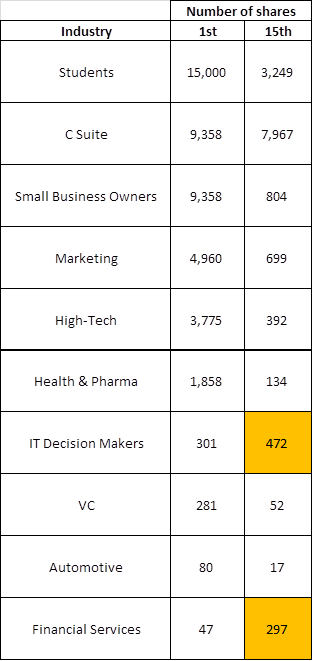
I assume the tool’s ranking is based (sensibly) on shares by members of the specific section e.g. Health & Pharma, concerned. This explains the instances shown in orange – IT Decision Makers and Financial Services – where the 15th placed article has received more shares overall than the 1st placed.

This must be because less of their shares were within the specific section being evaluated e.g. the 15th ranked article in Financial Services must have received less than 47 of its 297 shares in this specific section or it would have to outrank the 1st article.

The interesting takeaway for me is that the more specific groups – High Tech, ITDM, Health &  Pharma, Automotive, Financial Services and VC (with the exception of Marketing) – all require less than 500 shares across the entirety of the 270million+ members in order to rank in the top 15. In Health & Pharma, VC and Automotive it’s less than 150.

In a measurement context therefore a piece of content in any of these areas that is receiving tens of shares would appear to be significant.

US content dominates

All of the top ranked articles are from US sources and a quick scan of the others in each section suggests this is the case across the board. No great surprise given that US members are the biggest group at around 30% of the total.

Articles checked for share stats

Students

1st How to Answer Stupid Job Interview Questions
15th
How To Become A Jedi Knight

C Suite

1st 18 Things Highly Creative People Do Differently
15th Confidence. Conviction. Charisma: The Art of the Sale. 

Small Business Owners
1st 18 Things Highly Creative People Do Differently
15th 5 Hashtag Tracking Tools for Twitter, Facebook and Beyond 

Marketing
1st Behind the Preplanned Oscar Selfie: Samsung’s Ad Strategy
15th 5 Business Goals of Content Marketing

High-Tech
1st Big Data: The 5 Vs Everyone Must Know
15th Is Microsoft telegraphing the demise of Windows Phone?

Health & Pharma
1st Saying Goodbye to the Old World of Healthcare
15th A Third Of Nursing Home Patients Harmed By Their Treatment

IT Decision Makers
1st How to Build Trust as a New IT Executive
15th 6 IT Strategies to Stay Ahead of Data Center Trends

VC
1st New York VC Investments Top $1B In The First Quarter
15th The Top Venture Capital Investors By Exit Activity – Which Firms See the Highest Share of IPOs?

Automotive
1st First Times Drive: 2015 Audi A3 e-tron plug-in hybrid
15th Hyundai Revamps Sonata That Upgraded Carmaker’s Image 

Financial Services
1st Employee’s Whole Life at-a-glance
15th Should I Rent My House If I Can’t Sell It?

Social Media News Releases achieve three times the pickup

In the summer of 2009 we did some analysis looking at whether Social Media News Releases (SMNR) achieved more coverage than “traditional” press releases. The analysis of almost one thousand releases showed that SMNRs distributed by RealWire generated twice the editorial coverage and almost four times the blog coverage.

A few weeks ago whilst discussing the timing of a FIR interview with me on the value of press releases (which is now published here by the way) Shel Holtz asked me if I had any plans to update the research. As it had been over 18 months this seemed a good idea so I booted up Excel and here are the results

Social-Media-News-Release-Coverage-Analysis-Results-2011

1,044 releases were analysed from those distributed in the 6 months from September 2010 to March 2011
Coverage is data is based on RealWire’s Proveit coverage tracking and evaluation service
79 were Social Media News Releases (releases related to 62 different companies, across 21 different industry sectors)
965 were “Traditional” Releases (releases related to 339 different companies, across 28 different industry sectors)

So overall the sample of SMNRs achieved over three times as much editorial/blog coverage on average (15.7 pieces v 5.0 pieces) as the “traditional” releases.

Some examples from different sectors of high performing SMNRs include releases by Panasonic, Alterian, 3M, Warner Bros, Rolls Royce and Aviva.

As with the previous analysis I think one of the primary reasons for the difference in performance is that the additional investment that can often be required to produce an SMNR – multimedia assets, links to background research etc – means that they are used for stories that the sender perceives are potentially high impact and therefore likely to be of interest to a wide audience.

Another reason could be the lower proportion of B2B releases in the SMNR sample. However I am not necessarily convinced this is the case as there are plenty of examples of B2B releases in the traditional sample that performed to a similar level as the best performing B2C SMNRs.

As I indicated in my interview with Shel I think it is more likely that a higher proportion of traditional releases are more informative in nature e.g. new appointment, new customer, financial results, tradeshow attendance etc. These stories are of potential value to relevant publications, but it is likely that the number of such publications will be lower than where the release is around a broader topic of conversation e.g. research, market changes, new products etc. If people would find this of interest then let me know in the comments as further study of the nature of the releases themselves might shed some more light.

In the meantime on a short promotional note it is good to see that our overall pickup stat of 80%+ of releases gaining editorial/blog coverage still compares very favourably with our competition :-)

PRFilter Technology PR Rankings launched

The PRFilter platform has been publicly live for a month now and in that time there have been thousands of searches performed. But as well as finding relevant press releases PRFilter now has a wealth of data on press release content.

Independently Adam Sherk last month used PRFilter to look at how often buzzwords are used in releases – read more about it here. We in turn thought it would be interesting to look at which technology brands, topics and products have been talked about most in press releases over the last couple of months. As an industry there is a lot of time and money spent analysing what the media writes/talks about, but what are PRs trying to talk about and do the two things fit?

Thats why we have produced our first PRFilter Technology PR Rankings. These rankings analyse the tens of thousands of releases indexed by PRFilter each month and look for the most talked about technology brands, topics and products within them.

Highlights from this first month (February 2011) include:

  • MicrosoftFacebook and Verizon were the top three most referenced technology brands.
  • Cloud related technologies, websites and wireless were the top three most referenced technology topics with iPhone and iPad the top ranking products.
  • Mentions of Microsoft and Facebook were around twice the number of Apple (ranked 5th).
  • Releases mentioning cloud technologies were more than twice as frequent as those referencing social media however this was down from three times as frequent in January.
  • iPad related releases were down 37% perhaps reflecting a calm before March iPad2 storm.
  • Significant increases in mentions of telecoms brands e.g. EricssonNokia and ZTE and technologies e.g. LTE and NFC, reflecting the hosting of Mobile World Congress during the month.

A presentation of the full details of the Top 25 technology brands and the Top 50 technology topics/products can be found here or view below.

This first month’s rankings demonstrate that a large number of stories are being created around certain brands and topics and not all of these are necessarily in areas that are likely to provoke great interest from the media.

We hope that producing these monthly rankings will assist public relations practitioners in developing a higher proportion of stories that journalists and bloggers find of interest and lead to improved coverage for the companies concerned.

As this is the first month there are bound to be things we could do better or information people would like to see next time so please let us know in the comments.

We have also started with Technology because that was the sector PRFilter was initially focussed on when it was first launched. However if there is demand we will look to expand the rankings to cover other sectors. Again feel free to let us know.

Online readership analysis – is bigger better?

Following my post the other week regarding online readership, sparked by some aggressive sales tactics by one of our competitors, I got talking to Andrew Smith of Escherman and we agreed to jointly carry out a more extensive piece of analysis looking at 50 different online news sites.

We selected ten sites each from the following areas – UK Nationals, Business, Marketing, Technology and Consumer. There was no particular selection process, just an attempt to have a reasonably representative sample and we both hasten to state that this is a relatively limited exercise which should therefore be taken with at least a pinch of salt. Particularly since indexed urls have been used as a proxy for content as this can be impacted significantly by site structure (as stated in slide 21), with some sites having sub domains and/or a more complex content directory structure.

However at the same time with the data that is readily available we think it provides some (arguably) valuable food for thought. So after several hours of research, number crunching and graph generation here are the results (I suggest you view in full screen mode unless you have excellent eyesight):

Site data is sourced from Google for the number of indexed urls via the “site:domain” command and from AdPlanner for the traffic data.

We are effectively looking at three areas:

Readership per article – average numbers of UK page views per Google indexed url per month. Where indexed url is a proxy for the number of likely visited pieces of content.
Engagement – time spent per page to indicate how long a reader is likely to be spending reading that content when they get there.
UK Relevance – what proportion of the sites readers as a whole come from the UK and would therefore be likely to be relevant if you were trying to reach a UK audience.
Andrew has provided his take on the results from a PR perspective here. For my part the highlights are:
Readership
Unsurprisingly readership per article is much higher for UK Nationals and Consumer than the sector specific publications. However within the performance of UK Nationals and Consumer a handful of sites stood out for having particularly high UK traffic per article being, in order, News of the World, Heat, The Sun, The Mail, Closer Online and Marie Claire.
Interestingly though if you remove these six high scoring sites from the samples then the sector specific sites still achieve, on average, between 30-60% of the readership per article of the remaining UK Nationals or Consumer titles.
Within the sector specific titles there were equally some significant differences in results with Techcrunch Europe, The Register and T3 being at the top end in views per url in Technology; Marketing Week and NMA in Marketing; and is4profit, Startups, Businesszone and Real Business above the average in the Business group.
Engagement
The top six engagement scores were achieved, in order, by Reuters UK, Information Age, Financial Times, Business Zone, The Independent and The Register. A very different result to the readership per url figures.
This difference was further underlined with the Business and Technology sites achieving on average approximately twice the time spent as Consumer sites. Evidence for both more in depth content and greater engagement, which doesn’t seem surprising.
Relevance
There are significant differences within each group with regards to proportion of UK traffic. Within UK Nationals the tabloids are generally between 60-75% UK based with the qualities between 30-55%; the FT having the lowest UK traffic proportion with 31%.
Within Business titles the vast majority of sites are UK focussed and because of this their audiences are predominantly UK based also. The exception being The Economist with only 7% of its audience being from the UK according to AdPlanner. Interestingly this seems to reflect the broad geographical interest of its content with even the US only accounting for just over a third of its traffic.
Its a similar picture within the Marketing titles with the vast majority of traffic to the sites selected being UK based. The marketing publication with the lowest UK proportion is Econsultancy with 57% from the UK. This in in part due to around 20% being from the US which seems consistent with their having a US presence.
Finally Technology and Consumer titles have quite varied levels of UK traffic with sites such as Techcrunch Europe and Vogue.co.uk (clearly having the potential for interest from outside the UK) having lower proportions of UK traffic at around 20-40% compared to sites such as T3 and Heat which are between 75-100%.
Conclusions
Though limited the analysis provides evidence for savvy PR people who already know that it is important to ensure that you understand the publications they engage with and their potential to actually reach the readers and communities most relevant to them and their clients and not be blinded by big traffic numbers.
There are many other points that could be drawn out of the results and we would love to get feedback from people on anything they observe or suggestions as to how to refine the analysis and improve the validity of the results.
Notes
The other publications analysed not mentioned above were:
UK Nationals
Business
Marketing
Technology
Consumer

Online Visibility-its not the size of your traffic that counts

At RealWire we have recently become aware that a major wire service is making a big deal out of their website’s high traffic numbers. In fact they have been specifically targeting the market trying to argue that their service is hugely better where visibility is concerned.

However they don’t mention the following three crucial issues about the traffic to their site.

1. That volume of traffic is clearly going to be affected by quantity of content.

2. The time visitors actually spend reading their content.

3. The relevance of those visitors to the content.

At RealWire we are always keen to make sure that discussions are based around the facts so let’s look at each of these in turn to see how our readership, engagement and relevance are all in fact apparently superior to Big Wire Corp’s.

Quantity of content

Q: Which is the more “popular” of the following two sites?

Site A – 1 piece of content and 1,000 page views in a month
Site B –  1 million pieces of content and 1 million page views in a month

Well according to their literature Big Wire Corp would apparently see Site B as a more popular destination because it has 1,000 times more page views. Makes sense, bigger is better right? Wrong.

Site A’s one piece of content has been viewed 1,000 times, whereas each of Site B’s stories has only be viewed once on average. Now which site is more popular? Site A of course.

Now let’s apply this concept to Big Wire Corp’s website.

First of all let’s get an idea of volume of content. The Google “Site:[url]” command gives you the number of unique pages indexed by Google on a particular site – a good proxy for the amount of content.

In this case the answer is 406,000.

Next we need an idea of traffic to the site. Google AdPlanner provides estimates of monthly page views.

In this case the answer is 7.5 million

I we then divide page views by content, we get an estimate of the number of views per article per month. Answer 18.5.

RealWire’s equivalent data from the same sources is
Content – 5,500
Page views – 200,000* (less than 3% of Big Wire Corp’s figure)

This gives 36.4 page views per article per month.

Twice the Big Wire Corp figure suggesting RealWire has higher readership for each article.

*I happen to know that the page view figure is too high in RealWire’s case (we do have analytics of course) but it could equally also be so for Big Wire Corp and so until I can get a hold of actual numbers for them I am being consistent.

Engagement

Q: Which of these two sites is engaging its readership the most?

Site A – average time spent on each page 2 minutes

Site B – average time spent on each page 5 seconds

Site A obviously. Each of the readers are spending 24 times longer reading an article on average than on Site B.

So let’s apply this to Big Wire Corp again.

Again Google AdPlanner can help. It tells us how many visits the site receives and how long each one lasts. From this we can get Time spent per Page as follows:

Time spent on page calculation

Big Wire Corp numbers

Time spent per visit = 3 minutes 50 seconds (230 seconds)
Total page views = 7.5 million
Total visits = 3.5 million

Time spent per page = 107.5 seconds or 1 minute 47.5 seconds

RealWire numbers

Time spent per visit = 8 minutes (480 seconds)
Total page views = 200,000
Total visits = 64,000

Time spent per page = 153.6 seconds or 2 minutes 33.6 seconds

43% more than Big Wire Corp suggesting readers of RealWire content are more engaged.

Relevance

Q: Which of these two sites is most likely to have the most relevant readership to a UK relevant story?

Site A – 100% of visits from the UK

Site B – 1% of visits from the UK

A: Site A – Yes I know these are getting ridiculously easy now! :-)

Big Wire Corp’s market report focusses on US usage of their site when comparing themselves to others such as RealWire. However given that the vast majority of their content is from US companies it will come as no surprise that the vast majority of their traffic does as well. Google Ad Planner again helps us out.

US traffic – 76% of total

But the majority of RealWire’s clients and therefore content are from the UK. So what’s Big Wire Corp’s UK traffic like?

UK traffic – 3% of total.

And RealWire’s UK traffic? Well AdPlanner estimates around 75% but the real figure is nearer 45% or 15 times the Big Wire Corp figure.

Suggesting that RealWire’s traffic is around 15 times more likely to be relevant.

Conclusion

When evaluating traffic between sites it is imperative that you don’t get drawn in by the size of headline traffic numbers and that you consider:

a) normalising traffic for levels of content

b) how engaged the readers are

c) how relevant the readers are

Or you could find yourself reaching some very misleading conclusions. Just ask Big Wire Corp :-)

* Hattip to Andrew B Smith for highlighting the value of Google Adplanner for such analysis