Another “If I was Jack” post: Top 3 things Twitter needs to do to stay relevant

There’s been a lot of talk over the last week or so about what Twitter needs to do to turnaround its fortunes. As someone who’s spent more time than is probably healthy looking at Twitter data over the last three years I thought I’d throw in my two penneth.

Here are the three areas I think are crucial to address.

Note none of them relate to tweets or ads. True, changes to video, ability to edit tweets, tweet length, ad options etc. might improve things in the short term. But I’m convinced in the medium/long term they’re like moving the deckchairs on the Titanic.

Effective policing

Twitter’s public nature (protected accounts aside) is a major reason why it appeals to a minority of people. Those who accept, or are naïve about, the risk involved with such a platform.

Friday night saw an example of such naivety from a Twitter employee of all people in response to the #RIPTwitter hashtag:

His experience was pretty mild though.

Frequent stories about people attacked by trolls, spammers and bullies can’t be helping user growth. Some investment has been made to address this, but it must be maintained.

Freedom of speech and expression is something to be valued. But just like society won’t tolerate all behaviour, nor should Twitter.

Update: While I’ve been drafting this post today, Twitter has announced the creation of a Trust and Safety Council.

Follow spam

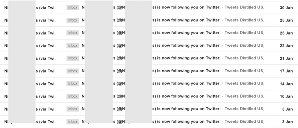
Hands up who’s been followed multiple times by the same account? Here’s a screenshot of an account that followed our @Tweetsdistilled account ten times last month.

Multiple follows tweets distilled us

Each time it’s unfollowed and tried again because @Tweetsdistilled didn’t follow it back. Such automated follow spam is a joke. If these are the kind of users Twitter thinks it needs to be serving then it really doesn’t have a future.

At the moment anyone can follow up to 5,000 accounts. You are then limited to following only 10 per cent more accounts than the number that follow you. So to follow more than 5,000 accounts you currently need 4,545 followers.

I’d suggest changing this ratio to substantially less than 1.0x after 5,000 accounts. For example, if set at 0.25x then if you wanted to follow 6,000 (1,000 more) you would need to have 8,545 followers (4,000 more).

I’d also place stricter limits on the number of times you can follow the same account than appears to be the case at the moment. Twice in any 30 day period would be enough to allow for an accidental unfollow!

Combined, these changes would still allow people to grow their followers, but would mean they could only do so if they were interesting to an increasingly large group of users.

Why do I know these constraints shouldn’t be an issue?

Because of 2.57 million accounts that Lissted has identified as having any real influence potential on Twitter, 95 per cent of them (2.44 million) follow less than 5,000 accounts. Of the remaining 124,000 accounts, 24,000 would still be within the parameters I’ve suggested.

Here’s a table summarising the stats:

Following analysis

You can see the remaining 100,000 accounts have more follow relationships (2.619bn) than the other 2.47 million combined (2.449bn).

And these are just the accounts that Lissted has identified as having some degree of likelihood they are “genuine”. There are probably more that are pure spam that Lissted filters out.

So this tiny minority, less than 0.1 per cent of Twitter users is creating this huge amount of irrelevance.

Communities

A key strength of Twitter is the groups of experts you can find related to pretty much every industry, profession and topic you can think of.

In my opinion Twitter focuses too much on promoting “celebrities” and not enough on these niche communities.

Twitter needs to provide new and existing users with simple and effective ways to “plug into” them.

Inside Twitter

This could be done within the existing feed mechanism. Over the last 12 months our niche Tweetsdistilled accounts e.g. @PoliticsUKTD, @HealthUKTD and @EducationUKTD have been demonstrating this. They’re like a cross between Twitter lists and ‘While you were away’. Having chosen to subscribe to the feed it then posts interesting tweets from the community into your timeline and like Twitter lists you don’t need to be following the specific accounts concerned.

They appear to be doing something right, as they’re followed by many key members of these communities. Even accounts you might assume would have this covered anyway.

Outside Twitter

I’d love to know the engagement stats for the Popular in your Network emails. Does anyone actually look at them? For new users they seem to focus heavily on celebrity tweets. My suspicion is if you wanted to sign up for Stephen Fry’s or Kanye’s tweets you’d have done it by now.

Instead, why not allow users to subscribe to a summary of what communities have been talking about. The content they’ve shared and the tweets they’ve reacted to.

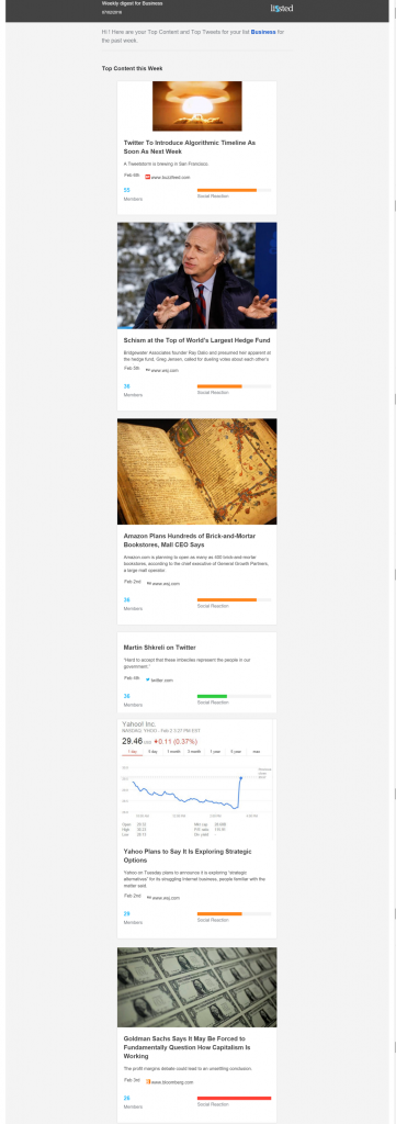
Lissted can now deliver daily and weekly digests of the most interesting content and tweets from an array of communities. Here’s Sunday’s US Business community weekly digest for example.

USBusinessLisstedWeeklyDigest070216

To produce these digests Lissted actually combines the response of a Twitter community with the wider social reaction across Facebook, LinkedIn and Google+. But it still demonstrates Twitter has the ability to be seen as a powerful intelligence tool for new and existing users with minimum investment on their part.

If you have 7 minutes to spare here’s a detailed story we produced last October about how this could also help Twitter in an onboarding context too.

Over to you Jack

Twitter’s next quarterly results announcement is tomorrow (10th February). I wonder if any of these areas will be addressed….
A tiny fraction of real conversation is analysed by social media monitoring tools

Social media listening tools can provide powerful insights when they’re used to find answers to really good actionable questions.

But recently I’ve noticed a move to start making absolute statements based on such analysis. I highlighted one such area earlier this year in relation to the UK general election. Some people even suggested Twitter could predict the outcome. They were wrong.

The thing is, as much as social data can be powerful and seem vast in scope, you still need to keep a sense of perspective.

It’s been estimated that every day people speak an average of around 16,000 words. With this in mind I thought I’d try and make a quick estimate of the proportion of people’s conversation in North America and the UK that social media monitoring data represents.

Answer? 0.16 per cent* 

And that’s before we get into issues like spam accounts, bias towards power users’ output, questions about whether tweets and posts are truly an authentic reflection of what people think and feel, demographic bias and the online disenfranchised.

I based my estimate on Twitter and Facebook, as they represent the majority of conversation that such tools access. We could add Reddit, blog posts, comments on online articles and YouTube videos, forums etc, and if anyone fancies doing so, be my guest! But I don’t expect you’ll get to a much bigger number.

Particularly as on the other side of the equation we could add to what people say other forms of conversation that aren’t accessible to social listening: emails, messaging apps and collaboration tools like Slack to name a few.

So does this make social listening as an insight tool a waste of time?

No, of course not. I’ve spent enough time buried deep in social data to know that it can provide hugely valuable insights. But to achieve this you need to be extremely focussed.

Ask good questions

Structure questions that take into account the limitations of the data. “Who does Twitter conversation suggest is going to win the UK general election?” does not fall into this category. Also ensure the answer doesn’t lead to a “so what” moment, but provides a genuine basis to take more action.

Say no to pretty noise

Pretty dashboards that pluck results out of the ether aren’t the answer. Make sure you understand exactly who you’re listening to – who is behind the data.You need this audience perspective to be confident what you’re seeing is real insight and to address what I call the four (f)laws of social listening.

Be sceptical

Sometimes social media analysis gives you an answer you didn’t expect, one that differs from your existing world view. It’s crucial you don’t dismiss such answers as they could be the most valuable insights you’ll ever get. Equally, don’t naively just accept them at face value. Challenge. Try and triangulate the answer from another source. Try asking the question in a different way and compare the answers. Sometimes you can be surprised.

* You can see my back of an envelope calc here. The estimated variables are editable in the “Try your own” sheet (highlighted in blue) so you can have a play to work out your own figures. In simple terms we’re comparing:

Talking: c. 422 million people across US, Canada and UK using 16,000 words per day = 6.75 trillion words.
Twitter: c. 137 million tweets (N. American and UK users assumed at 27.5 per cent of active users multiplied by 500 million tweets per day) assumed to contain an average of 25 words = 3.4 billion words
Facebook: c. 707 million Facebook posts per day (N. American and UK users assumed at 16.4 per cent of users multiplied by 4,320 million posts per day) assumed to contain an average of 50 words = 35 billion words. Only 20 per cent of these posts assumed to be accessible by social listening tools. I have no specific basis for the level of this last assumption, though clearly it is the case that social listening tools can’t access all Facebook data – though Datasift’s PYLON offering provides a potential solution to this privacy issue. However even if you assume all posts accessible the result only increases to 0.57 per cent.

Metrics are vanity, insights are sanity, but outcomes are reality

There’s an old business saying:

Turnover is vanity, profit is sanity, but cash is reality*.

* another version replaces reality with “king”

The implications are pretty obvious. No matter how much turnover (or revenue if you prefer) you generate, if it doesn’t turn into profit you’ll only survive if someone keeps pumping in cash.

If you generate profit, but you don’t convert that profit to hard cash, then you’ll end up in the same boat.

A similar issue applies to social listening, analytics and measurement in general.

Vanity metrics and pretty noise

You can’t move for the number of tools and platforms that will give you graphs and metrics of social media data. The frequency of mentions of this, how many likes of that, the number of followers of the other. All wrapped up in a beautifully designed dashboard.

The thing is this “analysis” is often nothing more than pretty noise.  And the danger is it can be worse than meaningless, it can be misleading.

Insight

Really insightful

To find real insight we need to know the who, what and why of the data behind the numbers, how this relates to what we’re seeking to discover and most importantly of all, we need to know the right questions to ask.

The UK General Election social media coverage was a great example of how not to do this. All the attention was on counting stuff and comparing who had more of this and less of that.

Far too few asked questions like: who was active in these online conversations, why were they participating, and were they likely to be representative of what you were trying to understand?

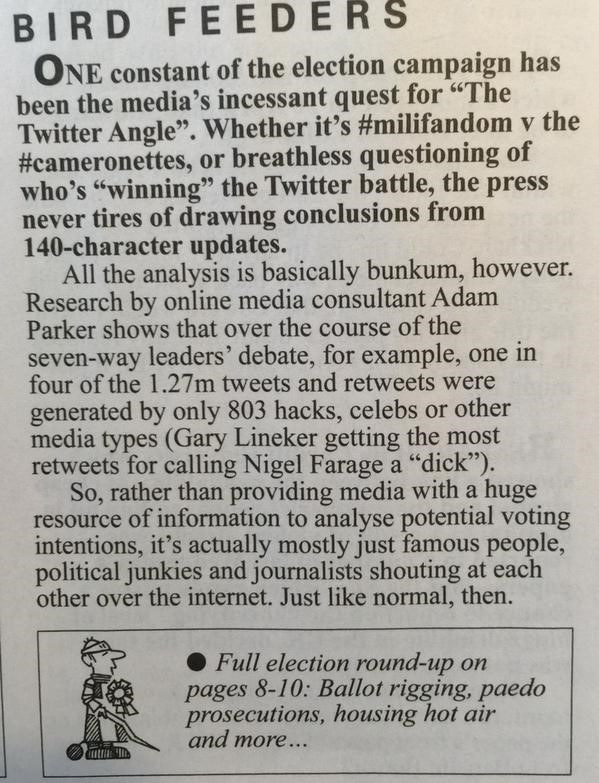
Private Eye Twitter analysis

It’s the outcome that really counts

Finally “actionable insight” is a phrase we hear all the time. But even when it’s an accurate description, the key element is “able”.

If we don’t possess the skills, resources or confidence to take the action required, then the whole exercise was pointless. So don’t bother asking a question unless you’re able to follow through on the answer.

Because it all comes down to this – what is the outcome of your action in the real world?

After all, just ask Ed Miliband whether his Twitter metrics were much consolation when it came to the result of the election.

Ed Miliband

Hat tip to Andrew Smith who inspired this post with his comment to me that with Lissted we’re seeking to focus on “sanity, not vanity”.

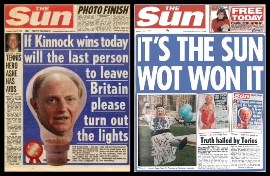
Twitter may end up being “wot won it”, but perhaps not for the reason you think

image-20141121-1040-21hs1iAnalysis of the Twitter chat around the UK General Election 7 way #leadersdebate suggests that Twitter’s influence on the outcome may not be because of it’s role as a conversation and engagement platform.

It could primarily be due to the highly effective broadcasting and amplification activities of small groups of partisan individuals, combined with the subsequent reporting by the UK media of simplistic volume based analysis.

The 2015 UK General Election is being called the “social media election”. Twitter’s importance has been compared to The Sun newspaper’s claimed impact on the 1992 result. In fact, this comparison was also drawn in 2010.

With this in mind you can’t move for social listening platforms and the media, talking about Twitter data and what it represents: graphs of mentions of leaders and parties abound.

Some have even suggested Twitter data might be able to predict the result.

The problem is, the analysis I’ve seen to date is so simplistic it risks being seriously misleading.

Demographics

There are multiple reasons why you have to be very careful when using Twitter data to look at something as complex as the Election. I tweeted the other day that demographics is one of them.

Twitter is skewed towards younger people who are only a minority of those who will vote – and a significant number, 13 per cent, can’t vote at all.

This is valuable insight when it comes to targeting 18-34 year old potential young voters and trying to engage them politically e.g. for voter registration.

But it also shows that in a listening, or reaction context, Twitter’s user base is wholly unrepresentative of the UK voting population.

And there’s a potentially bigger issue with taking Twitter data at face value – vested interests.

#Leadersdebate

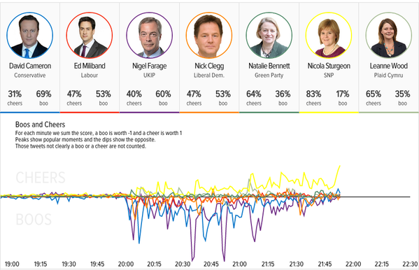
One of the first major examples of social media analysis that received widespread coverage was in relation to the seven way #leadersdebate. Many analytics vendors analysed the volume of mentions of leaders or parties, to try and provide insight into who “won”. What they didn’t do was question the motivations of those who participated in the Twitter conversation.

GB Political Twitterati

To investigate this I used Lissted to build communities for each of the seven parties represented in the debate – Conservatives, Labour, Liberal Democrats, SNP, Greens, UKIP and Plaid Cymru.

These communities comprise obvious users such as MPs and party accounts, as well as accounts that Lissted would predict are most likely to have a strong affiliation with that party based on their Twitter relationships and interactions.

They also include media, journalists and other commentators whose prominence suggests they are likely to be key UK political influencers, and a handful of celebrities were in there too.

We’ll call this group of accounts the “Political Twitterati”. 

The group contained 31,725 unique accounts[1] that appeared in at least one of the seven communities. This number represents only 0.2 per cent of the UK’s active Twitter users[2].

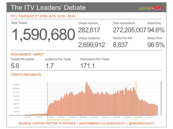
I then analysed 1.27 million of the tweets between 8pm and 11pm on the night of the debate that used the #leadersdebate hashtag, or mentioned some terms relating to the debate. 

Within this data I looked for tweets either by the Political Twitterati, or retweets of them by others.

Findings about the Political Twitterati

- 25x more likely to get involved in the conversation [3]

So we know they were motivated.

- Accounted for 50 per cent of the conversation [4]

So they were highly influential over the conversation as a whole.

- Included 69 per cent of the top 1,000 participants [5]

So the vast majority of the key voices could have been predicted in advance.

Analysis by Political Affiliation

I then broke the Twitterati into four groups.

– Journalists, media, celebrities and other key commentators who generally appeared in multiple communities

– Directly related to a party e.g. MPs, MSPs, MEPs or accounts run by the parties themselves

– Accounts with a strong apparent affiliation to one party because they only appeared in one of the communities

– Other accounts with mixed affiliation

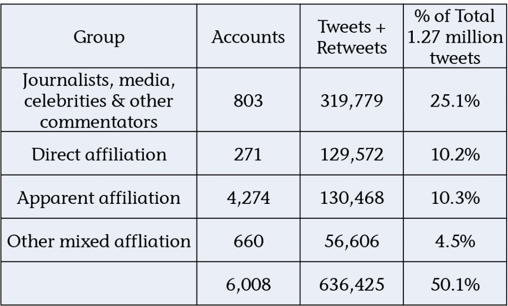
Here’s a summary of their respective activity:

Political Twitterati split

We can see that one in four tweets were generated by only 803 journalists, media, celebrities or other commentators.

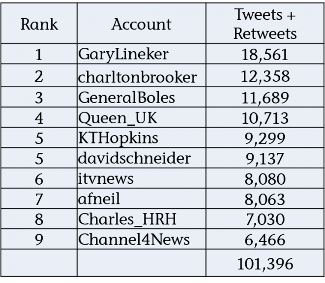
The top ten of which were these:

Top 10 from Political Twitterati

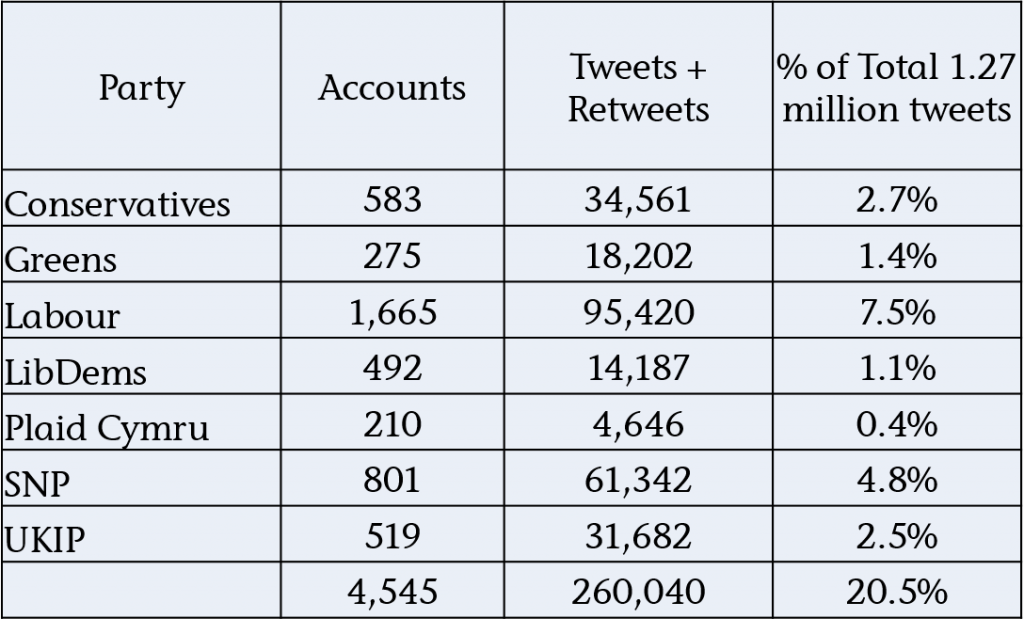
We can also see that one in five tweets were generated by accounts that had a direct[6] or apparent political affiliation[7].

If we break these down by party we get this analysis of politically affiliated reaction: 

Political affiliation leadersdebate

The numbers demonstrate how Labour and the SNP are able to shift the Twitter needle significantly through just a small number of participants.

The SNP’s performance is particularly impressive with only 801 accounts generating almost 5 per cent of the whole conversation.

An example of tactics

So how do they do this? Well here are some examples of how the SNP community amplifies positive remarks made by (I think) non affiliated Twitter users.

The following are all tweets by users with less than 40 followers, who rarely get more than the odd retweet, but who in these cases got 50 or more out the blue.   Can you guess why? 

What you find when you look at the retweets in each case is that many are coming from accounts that would appear to have a SNP affiliation.

In fact look closer and you find that a number of the 779 affiliated accounts[7] appear.

Unsurprisingly, given the reputation of the SNP community for being very active and organised online, they were looking out for positive tweets about their party or their leader, and then amplifying them.

Conclusion

Simplistic analysis of Twitter data around a topic like the General Election has the potential to be at the least flawed and at worst genuinely misleading.

Not only are the demographics unrepresentative of the voting population, but the actions of small groups of motivated individuals are capable of shifting the needle significantly where simple volume measures are concerned.

The resulting distorted view is then reported at face value by the media, creating a perception in the wider public’s mind that these views are widely held.

Of the seven parties it would appear that what they learned during the Scottish Referendum is standing the SNP community in good stead when it comes to competing for this share of apparent Twitter voice.

So Twitter may indeed end up being “wot won it”, but potentially not because of general public reaction, engagement and debate, but because of highly effective broadcasting and amplification by a relatively small, but motivated group of individuals, and the naive social media analysis that is then reported by the media.

Notes:

1. Lissted can decide how many accounts to include in a community list based on a threshold of the strength of someone’s relationships with a community. The lower the threshold, the weaker the ties, and arguably the weaker the affiliation.

2. Based on 15 million UK active Twitter users.

3. 6,008 of the Political Twitterati accounts appeared at least once. That’s around one in five (6,008 out of 31,725).

119,645 unique users appeared in the data sample as a whole. Based on 15 million active UK Twitter users that’s around 1 in 125.

Suggesting this group of relevant accounts was 25 times more likely to have participated in the conversation than your average Twitter user.

Even if we take the figures based on Kantar’s wider sample above of 282,000 unique users the resulting ratio of 1 in 53 gives a figure of 10x more likely.

4. These 6,008 accounts tweeted 50,461 times. These tweets were then retweeted 585,964 times meaning they accounted for 636,425 of the tweets or 50.1%.

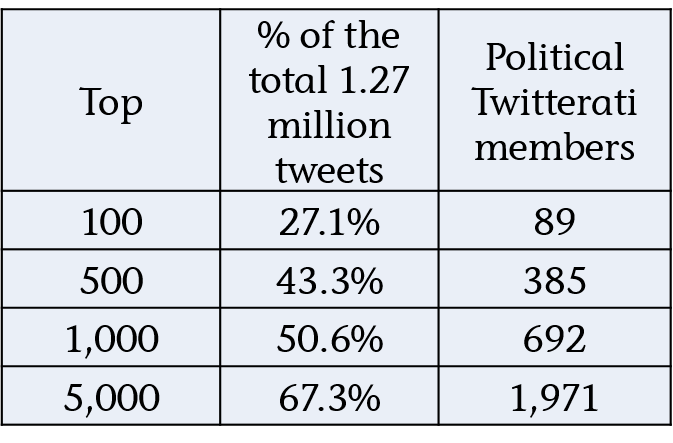
5. Looking at the top accounts that generated the most tweets and retweets in the data gives the following:

Top leadersdebate influencers The top 1,000 accounts generated over half of the tweets (50.6%) either directly or through retweets. 692 of these accounts appear in our Twitterati list.

6. Direct accounts

These are accounts directly affiliated with a party e.g. MPs, MSPs, MEPs or accounts run by the parties themselves.

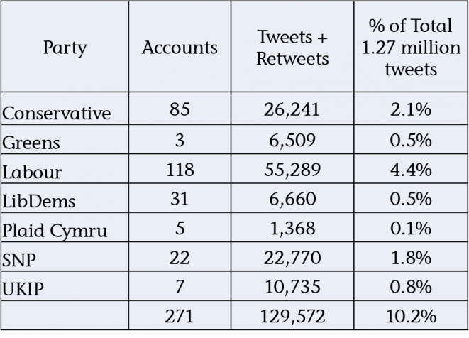
Breaking these down across their political affiliations we get the following:

Direct accounts breakdown

So this handful of 271 clearly biased individual accounts, were ultimately responsible for 10 per cent of the total tweets.

How likely do we think it is that people retweeting these party affiliated accounts were undecided voters?

7. Apparent affiliated accounts

At the other end of the scale there are the accounts that only appear in one of the communities.This suggests that these individuals have a very strong affiliation to one party and will equally be partisan.

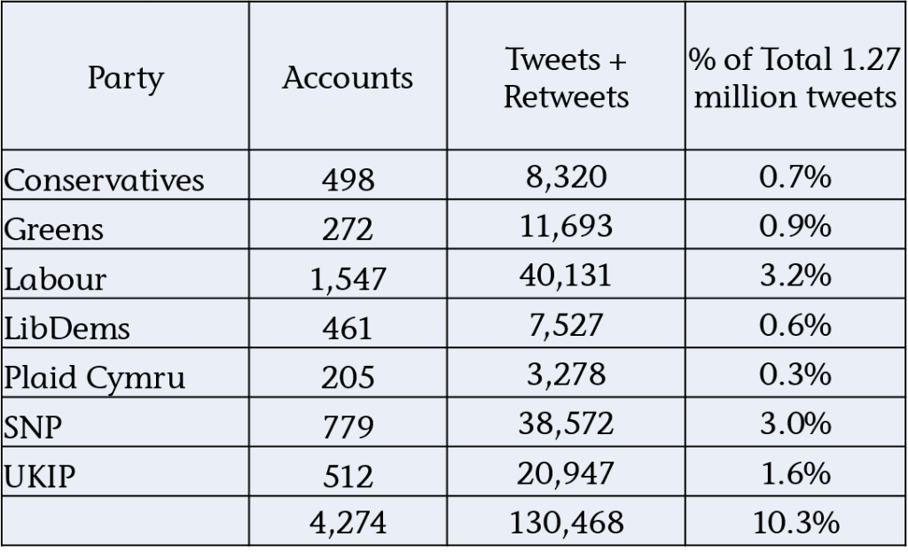
Within the 6,008 Twitterati accounts that participated were 4,274 that only appear in one of the seven communities (and weren’t included in the media/celebrity group).

Apparent affiliation

Between them these 4,274 users again accounted for 10 per cent of the total conversation.

The Labour party group comes out top with 3.2 per cent of the total tweets, but it’s the SNP group of 779 accounts, contributing 3.0 per cent, or one in thirty three of all tweets, that massively punches its weight in this group.

A cautionary tale of social media statistics

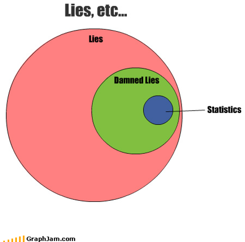
Lies damn lies and statistics
It’s important to understand the full context relating to social media statistics before you act on them.

The Stat

I came across this stat the other day:

91 per cent of mentions [on social media] come from people with fewer than 500 followers.

The implication in the source blog post and whitepaper was:

When it comes to your social media strategy, don’t discount the importance of brand mentions by Twitter users with low follower counts.

It’s complicated

Follower numbers shouldn’t be the be all and end all when it comes to defining your social media strategy. Agreed.

For a start, where influence is concerned, relevance, proximity, context and other factors are crucial. And followers is a very simplistic metric and depending on how they use social platforms, may have little in common with a person’s real potential for influence.

Also, even if the mention itself doesn’t influence anyone, simply the knowledge that an individual has shown an interest in your brand in some way is potentially of value.

But while sympathising with the inference drawn, I think the statistic and its underlying data would benefit from some numerical context to better understand their implications.

N.B. I’ve focussed on Twitter in this analysis as that’s where the majority of the data in the particular research apparently came from.

Analysis

Given the stat focuses on accounts with less than 500 followers, let’s split Twitter into two groups:

– Low Follower Group – Less than 500 followers.
– High Follower Group – 500 or more followers.

And then let’s look at two relevant areas – Impressions and Retweets.

Impressions

Who could have seen brand mentions by each of these groups and potentially been influenced by them?

To calculate this we need to know the following for each group:

– Average number of followers.
– Impression rate.

Average followers

I used this estimated distribution of follower numbers across Twitter users*, combined with Lissted‘s data on nearly 2 million of the most influential accounts, to calculate a weighted average of the number of followers each group is likely to have.

Results:

– Low Follower Group – 100
– High Follower Group – 8,400

Impression rate

Every time you tweet only a proportion of your followers will actually see it. For many users this proportion could be less than ten per cent. The “impression rate” represents the total number of impressions generated by your tweet, divided by your follower number.

It only includes impressions on specific Twitter platforms – web, iOS app and Android app. This means impressions in applications like Hootsuite and Tweetdeck don’t count.

The rate is also complicated by retweets. The rate calculated by Twitter Analytics includes impressions that were actually seen by followers of the retweeting account, who may not follow you.

I’ve tried to look at retweets separately below, so for the purpose of this analysis I’m looking for impression rates without the benefit of retweet amplification.

On this basis I’ve assumed an impression rate of ten per cent for the Low Follower Group and five per cent for the High Follower Group. These assumptions are based on various articles estimating impression rates in the range of 2-10%. For the sake of prudence I’ve used a lower rate for High Follower accounts on the assumption that they could have a higher proportion of inactive and spam followers.

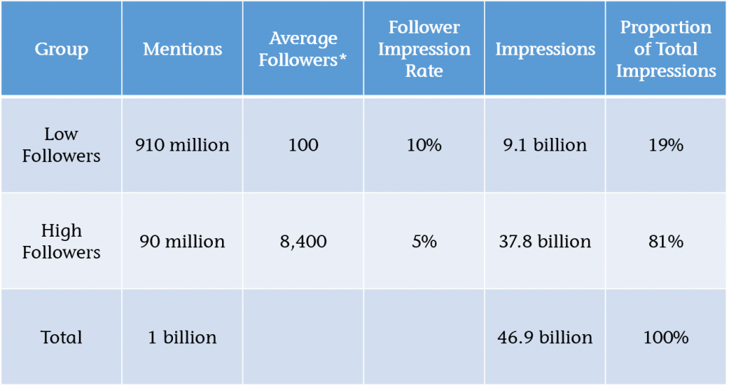
We can now calculate the proportion of total impressions related to each group as shown in this table:

Brand mentions impressions analysis

Finding: only 19 per cent of impressions relate to the Low Follower Group.

Quite simply the difference in reach of the High Follower accounts (84x higher – 8,400 v 100) more than offsets the difference in volume of mentions by the Low Follower Group (only 10x higher – 910 v 90).

For the Low Follower Group to even represent 50 per cent of the total impressions we’d need to assume an impressions rate for this group that is over 8x higher than for the High Follower Group e.g. 42% v 5%.

Though I suspect there may be a difference, is it really likely to be that much?

Retweets

Next we need to consider if any of the brand mentions were retweets. If so were the original tweets more likely to be by accounts with high or low followers?

A lot of retweets by volume are by accounts with low followers. That’s just common sense because the vast majority of Twitter users have low follower numbers. But when we’re exposed to a retweet it’s the original tweet that we’re exposed to. This is the very reason why Twitter includes the resulting impressions in the Impression rate (I’m assuming automatic retweets, not manual ones).

To understand this better I analysed a sample of over six million tweets tracked by Lissted over the last two months that were retweeted at least once. The sample included tweets by 1.27 million different accounts and collectively these tweets received over 200 million retweets in total.

Of these six million tweets, 0.6% of them (c.39,000) accounted for two thirds of the total retweets generated.

And 99 per cent of these “top tweets” were by users with 500+ followers.

Finding: a high proportion of retweets are of users with High Followers, even if many are by users with Low Followers.

Conclusion

Mentions relating to accounts with higher than 500 followers appear more likely to:

– represent the majority of initial impressions; and
– generate the majority of any resulting retweets.

In other words it’s high follower accounts that are more likely to be the source of the majority of the brand mentions that people are exposed to on Twitter.

Caveat

As I said at the start the purpose of this analysis is simply to give some proper context to an isolated statistic. Assessing the impact and actions you should take due to mentions of your brand requires consideration of a lot more factors than simply numerical exposure.

It could be the case that high follower tweets make up the vast majority of the mentions people are exposed to, but factors like trust, context, proximity and relevance could lead to mentions by low followers having more influence on business outcomes.

The key is to properly understand who is talking about you and why, and not base decisions on sweeping statistics.

*N.B the follower distribution analysis is from Dec 2013, but as Twitter hasn’t grown a huge amount in the last year, it seems reasonable to assume its validity. Happy to share my detailed workings with anyone who’s interested.