How Twitter could help solve Facebook’s fake news problem

Twitter shares by influential individuals and organisations could be harnessed in an automated news content rating system.

This system could assist Facebook in identifying articles that have a high risk of being fake. The methodology is based on a journalistic verification model.

Examples: the model would have rated as high risk:

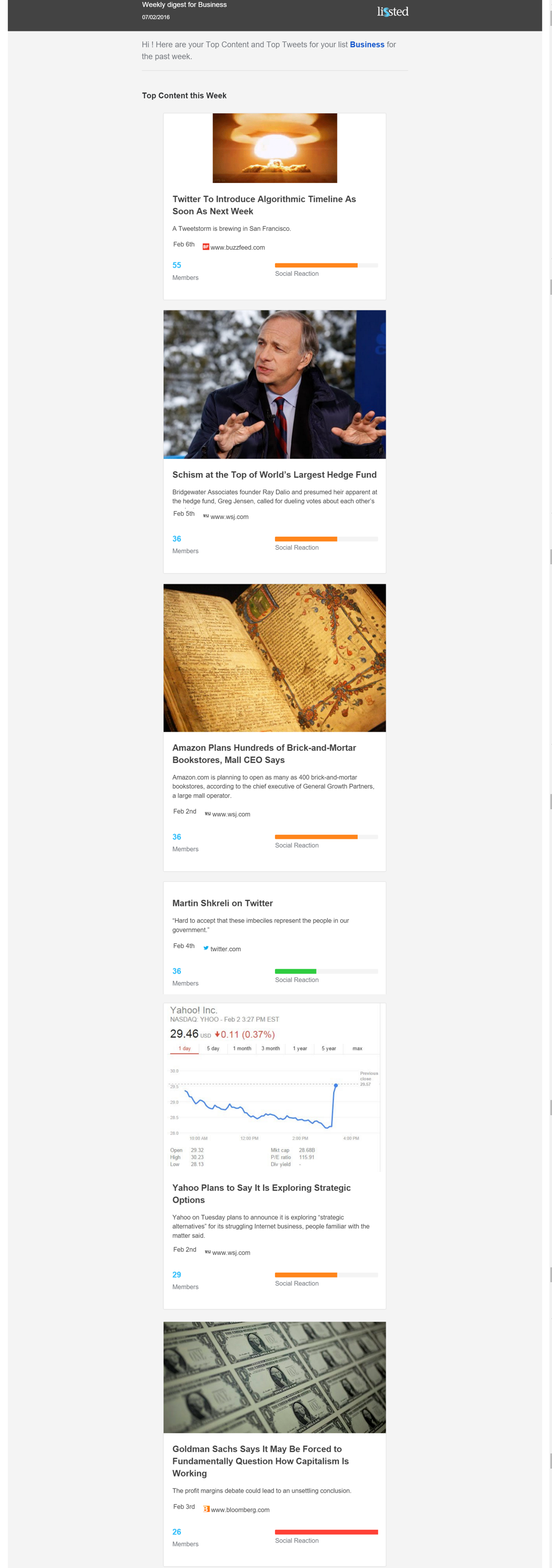
-FINAL ELECTION 2016 NUMBERS: TRUMP WON BOTH POPULAR ( 62.9 M -62.2 M ) – about the election results. It was ranking top of Google for a search for “final election results” earlier this week and has had over 400,000 interactions on Facebook. It was identified as fake (obviously) by Buzzfeed.

–  Pope Francis Shocks World, Endorses Donald Trump for President, Releases Statement‘. Shared  nearly 1 million times on Facebook. Now taken down, having been reported as fake by The New York Times

The rating system described below is subject to patent pending UK 1619460.7.

At the weekend Mark Zuckerberg described as “pretty crazy” the idea that sharing fake news on Facebook contributed to Donald Trump being elected President.

He went on to say in a Facebook post:

“Of all the content on Facebook, more than 99% of what people see is authentic. Only a very small amount is fake news and hoaxes. The hoaxes that do exist are not limited to one partisan view, or even to politics. Overall, this makes it extremely unlikely hoaxes changed the outcome of this election in one direction or the other.”

“That said, we don’t want any hoaxes on Facebook. Our goal is to show people the content they will find most meaningful, and people want accurate news. We have already launched work enabling our community to flag hoaxes and fake news, and there is more we can do here. We have made progress, and we will continue to work on this to improve further.”

Yesterday, Business Insider reported a group of students had hacked together a tool that might help.

I think part of the answer lies in another social network, Twitter.

An important aside

It’s important to note the topic of “fake” news is not black and white. For example, parody accounts and sites like The Onion are “fake news” that many people enjoy for the entertainment they provide.

There’s also the question of news that is biased, or only partially based in fact.

The idea proposed below is simply a model to identify content that is:

1. more likely to be fake; and

2. is generating a level of interaction on Facebook that increases the likelihood of it being influential.

Verification and subsequent action would be for a human editorial approach to decide.

Using Twitter data to identify potentially fake news

In its piece on Zuckerberg’s comments, The New York Times highlighted this article Pope Francis Shocks World, Endorses Donald Trump for President, Releases Statement (now removed) that had been shared nearly a million times on Facebook. It’s fake. This never happened.

If it had been true it would obviously have been a big story.

As such you’d expect influential Trump supporters, Republicans and other key right wing media, organisations and individuals to have been falling over themselves to highlight it.

They weren’t.

Lissted tracks the Twitter accounts of over 150,000 of the most influential people and organisations. This includes over 8,000 key influencers in relevant communities such as Republicans and US Politics, as well as potentially sympathetic ones such as UKIP and Vote Leave.

Of these 150,000+ accounts only 6 shared the article.

Extending the analysis

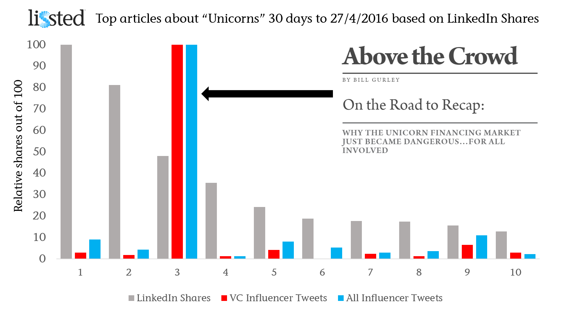
Lissted has indexed another 106 links from the same domain during the last 100 days.

The graph below shows analysis of these links based on how many unique influencer shares they received.

analysis-of-links

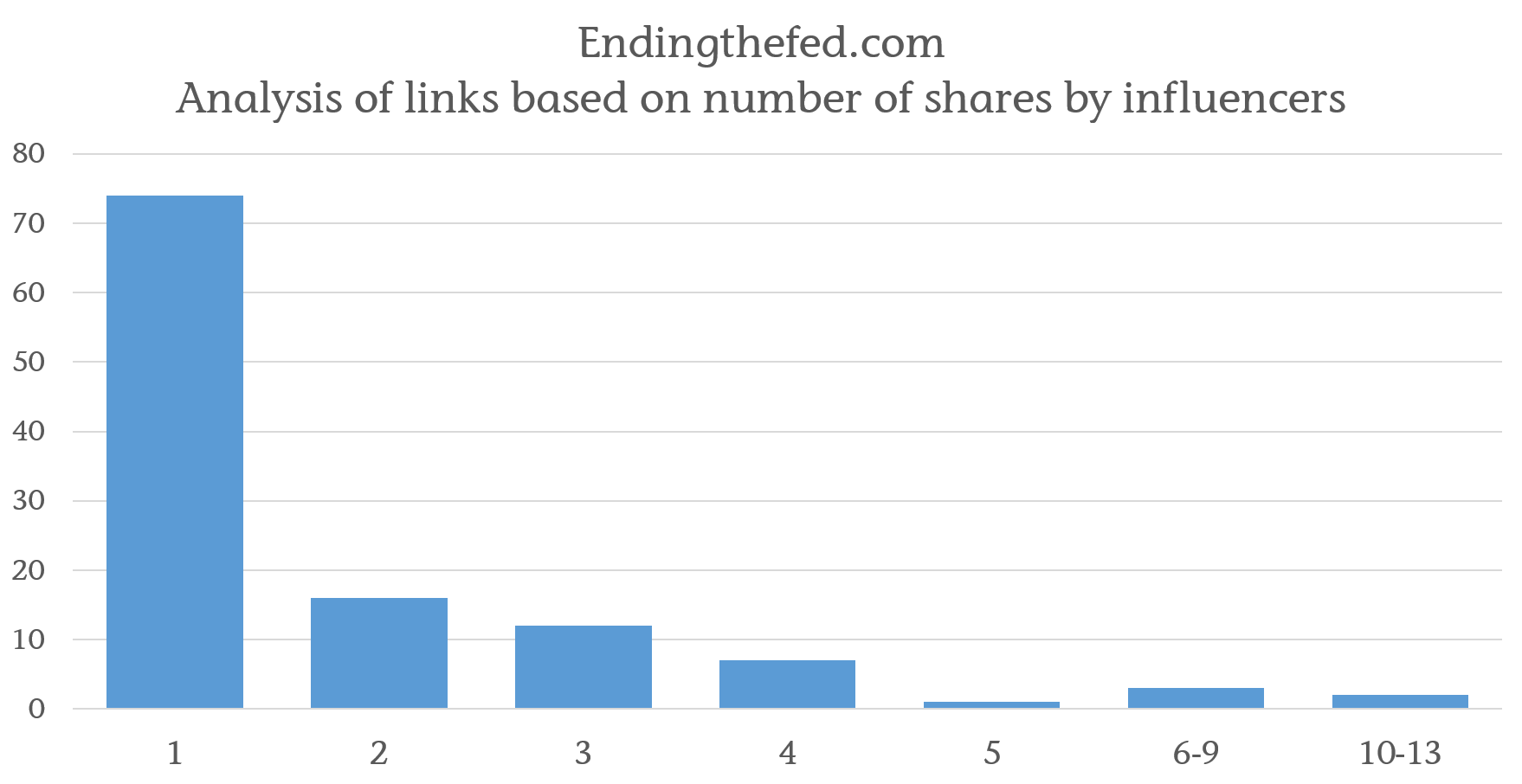
You can see that 74 of the 107 links (including the Pope story) were only shared by a single member of the 150,000 influencers we track. Only 5 have been shared by 6 or more and that includes the Pope story.

That’s just 196 influencer shares in total across the 107 links.

Yet, between them these URLs have been interacted with 12.1 million times on Facebook.

And of course these are the stories that have been shared by an influencer. There could be more that haven’t been shared at all by influential Twitter users.

Lissted’s data also tells us:

– 133 of the 150,000 influencers (less than 0.1%) have shared at least one of its articles; and

– the article published by the site that has proved most popular with influencers has received 10 shares.

How could this help identify high risk news?

You can’t identify fake news based simply on levels of reaction, nor based on analysing what they say. You need a journalistic filter. Twitter provides a potential basis for this because its data will tell you WHO shared something.

For example, Storyful, the Irish social media and content licensing agency, has used Twitter validation by specific sources as a way of identifying content that is more likely to be genuine.

I don’t know why very few of the influencers Lissted has been tracking shared the piece. But my suspicion would be that as influential members of their communities they’re:

– capable of spotting most fake news for what it is, and/or

– generally less likely to share it as even when it serves their purpose they know that they could be called out for it (they’re more visible and they’ve got more to lose); and /or

– less likely to be exposed to it in the first place.

Obviously, not all content will be shared on Twitter by these 150,000 accounts. But you can bet your bottom dollar that any vaguely significant news story will be. The temptation to want to highlight a genuine story is just too great.

Comparison to example of genuine content

To give the Pope story numbers some context, the table below shows a comparison to this piece on the Donald Trump website – Volunteer to be a Trump Election Observer (NB: post victory the URL now redirects to the home page).

comparion-table

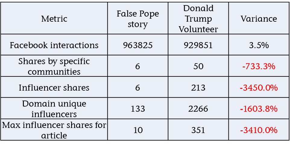
Both URLs have similar Facebook engagement, but there’s a huge difference in the influencer metrics for the article and the domain.

This is just one example though. If we build a model based on this validation methodology does it provide a sound basis for rating content in general?

NB: the model that follows focuses on content from websites. A similar, approach could be applied to other content e.g. Facebook posts, YouTube videos etc.

Proof of concept

To test the methodology I built a rating model and applied it to three sets of data:

1. The 107 links identified from endingthefed.com – data here.

2. Links that Newswhip reported as having 250,000+ Facebook interactions in the period 15/9/16 – 14/11/16 – data here.

3. A random sample of over 3,000 links that were shared by influencers from the specific communities above in the period 15/10/16 -14/11/16 – data here.

The rating model gives links a score from 0 – 100. With 100 representing a links that has a very high risk of being fake and zero being a very low risk.

To rate as 100 a link would need to have:

– received 1,000,000 Facebook interactions; and
– be on a site that has never been shared by one of the 150,000 influencers, including the link itself.

The distribution of rating for the random sample is as follows:

distribution-of-articles-by-risk-rating

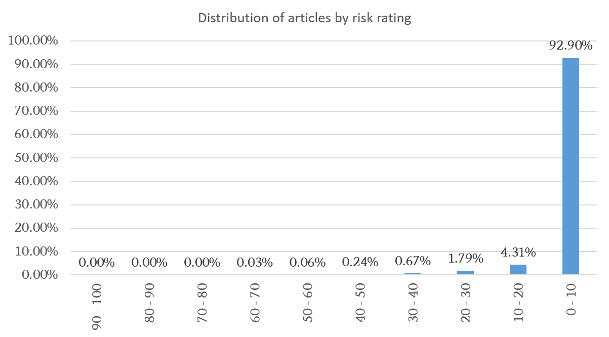
Mark Zuckerberg’s commented that less than 1 per cent of content on Facebook is fake. If we look at the distribution we find that 1 per cent corresponds to a score of 30+.

The distribution also shows that no link in the sample scored more than 70.

Finally over 90 per cent of URLs rated at less than 10.

On this basis I’ve grouped links in the three data sets above into 4 risk bands:

Exceptional – 70+
High – 30 -70
Medium – 10 – 30
Low – 0-10

Applying these bands to the three sets gives:

distribution-of-articles-by-risk-rating across three sets

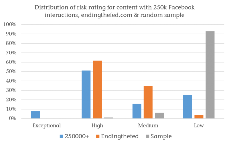
Unsurprisingly a high proportion of the 250,000+ group are rated as Medium to Exceptional risk. This reflects the fact that there are so few of them – 182 – and the implicit risk of being influential due to their high engagement.

Verifying these would not be a huge drain on resources as that translates to just 2 or 3 links per day!

The graph also shows how high risk the endingthefed site is with over 95 per cent of its content rated as High or Medium.

HEALTH WARNINGS

1. Being ranked as medium – exceptional risk does NOT mean the content is fake. It is simply an indicator. Just because one article on a site is fake does not mean that all the risky content is.

Also an article could be genuine viral content that’s come out of the blue from a new source.

The value in the model is its ability to identify the content that needs verifying the most. Such verification should then be done by professional journalists.

2. The rankings only reflect the 150,000 individuals and organisations that Lissted currently tracks. There could be communities that aren’t sufficiently represented within this population.

This isn’t a flaw in the methodology however, just the implementation. It could be addressed by expanding the tracking data set.

Example findings

The top 10 ranked articles in the 250,000+ group are as follows:

1. Mike Pence: ‘If We Humble Ourselves And Pray, God Will Heal Our Land’ (506k Facebook interactions, 0 influencer shares)

2. Just Before the Election Thousands Take Over Times Square With the Power of God (416k Facebook interactions, 0 influencer shares)

3. TRUMP BREAKS RECORD in Pennsylvania “MASSIVE CROWD FOR TRUMP! (VIDEO) – National Insider Politics (207k Facebook interactions, 0 influencer shares)

4. SUSAN SARANDON: CLINTON IS THE DANGER, NOT TRUMP – National Insider Politics (273k Facebook interactions, 0 influencer shares)

5. FINGERS CROSSED: These 11 Celebrities Promised To Leave America If Trump Wins (455k Facebook interactions, 1 influencer share)

6. Trump: No Salary For Me As President USA Newsflash (539k Facebook interactions, 0 influencer shares)

7. I am. (454k Facebook interactions, 1 influencer share)

8. A Secret Has Been Uncovered: Cancer Is Not A Disease But Business! – NewsRescue.com (336k Facebook interactions, 0 influencer shares)

9. The BIGGEST Star Comes Out for TRUMP!! Matthew McConaughey VOTES Trump! (294k Facebook interactions, 1 influencer share)

10. Chicago Cubs Ben Zobrist Shares Christian Faith: We All Need Christ (548k Facebook interactions, 1 influencer share)

My own basic verification suggests some of these stories are true. For instance Donald Trump did indeed say that he would not draw his Presidential salary.

However the Matthew McConaughey story is false and by the article’s own admission the Pennslyvania rally image is from April not October, plus there are no details on what “records” have been broken.

From outside the top 10 this post, rated as high risk, FINAL ELECTION 2016 NUMBERS: TRUMP WON BOTH POPULAR ( 62.9 M -62.2 M ) about the election results was ranking top of Google for a search for “final election results” earlier this week. It was identified as fake by Buzzfeed.

It would be great if any journalists reading this would go through the full list of articles rated as high risk and see if they can identify any more.

Equally if anyone spots URLs rated as low risk that are fake please let me know.

Further development

This exercise, and the mathematical model behind it, were just a rudimentary proof of concept for the methodology. An actual system could:

– utilise machine learning to improve its hit rate;

– flag sites over time which had the highest inherent risk of fake content;

– include other metrics such as domain/page authority from a source such as Moz.

Challenge to Facebook

A system like this wouldn’t be difficult to setup. If someone (Newswhip, BuzzSumo etc) is willing to provide us with a feed of articles getting high shares on Facebook, we could do this analysis right now and flag the high risk articles publicly.

Snopes already does good work identifying fake stories. I wonder if they’re using algorithms such as this to help? If not then perhaps they could.

Either way, this is something Zuckerberg and Dorsey could probably setup in days, hours perhaps!

Unicorns, content and engagement flights of fancy

When you’re seeking influential content, engagement metrics such as a Facebook likes and LinkedIn shares are too simplistic. You need to know more about who engaged with it and why.

On the Road to Recap Venture Capital Community ReactionLast week venture capitalist Bill Gurley published a post called On the Road to Recap.

For anyone who doesn’t know, a Unicorn in this context is a startup company with a valuation in excess of $1bn.

The post analysed in depth the current investment situation in relation to Unicorns and concluded:

“The reason we are all in this mess is because of the excessive amounts of capital that have poured into the VC-backed startup market. This glut of capital has led to (1) record high burn rates, likely 5-10x those of the 1999 timeframe, (2) most companies operating far, far away from profitability, (3) excessively intense competition driven by access to said capital, (4) delayed or non-existent liquidity for employees and investors, and (5) the aforementioned solicitous fundraising practices. More money will not solve any of these problems — it will only contribute to them. The healthiest thing that could possibly happen is a dramatic increase in the real cost of capital and a return to an appreciation for sound business execution.”

The post lit a fire in the VC and startup communities.

In fact Lissted ranks the post as the most significant piece of content on any investment related topic in the VC community in the last two months. 

So I thought I’d see how it compares to other recent posts about Unicorns.

Comparison with other “Unicorn” content

I searched across the last month for posts with the most shares on LinkedIn (URLs listed at the end). If you search across all platforms you end up with very different types of unicorn!

Having found the Top 10 articles on this basis, I then looked at the number of distinct members of Lissted‘s VC community on Twitter who shared each of the articles. The community tracks the tweets of over 1,500 of the most influential people and organisations in relation to venture capital and angel investment.

Finally for completeness I also looked at the number of distinct Lissted influencers from any community who tweeted a link to the piece.

In the graph the engagement numbers have been rebased for comparison, with the top ranking article for each measure being set to 100.

On the Road to Recap Venture Capital Community ReactionThe difference in reaction by the VC community and influential individuals in general is considerable.

15x more influential members of the VC community (169) shared ‘On the Road to Recap’ than the next highest article (11 -Topless dancers, champagne, and David Bowie: Inside the crash of London’s $2.7 billion unicorn Powa).

9x more influencers across all Lissted communities (419) shared the post (46 for the Powa piece).

VC Community reaction examples

Influential retweeters of Bill’s initial tweet above included Chris Sacca, Om Malik & Jessica Verrill.

Examples of key community influencers who tweeted their own views were:  

And people are still sharing it days later:  

Mythical measurement

So, the next time you set out to find influential content, don’t get too carried away with big engagement numbers. Focus on understanding where and who that engagement came from.

That way your conclusions will be legendarynot mythical.

If you’d like to get a daily digest of the influential content in the Venture Capital community, sign up for a free Lissted account here, then visit the Venture Capital page.

Lissted Venture capital page

Articles

1. Forget unicorns — Investors are looking for ‘cockroach’ startups now

2. What investors are really thinking when a unicorn startup implodes

3. On the Road to Recap: | Above the Crowd

4. Next Chapter: Cvent Acquired for $1.65 Billion

5. The fall of the unicorns brings a new dawn for water bears

6. Why Unicorns are struggling

7. Oracle just bought a 20-person company for $50 million

8. Silicon Valley startups are terrified by a new idea: profits

9. Topless dancers, champagne, and David Bowie: Inside the crash of London’s $2.7 billion unicorn Powa

10. 10 Startups That Could Beat a Possible Bubble Burst

Another “If I was Jack” post: Top 3 things Twitter needs to do to stay relevant

There’s been a lot of talk over the last week or so about what Twitter needs to do to turnaround its fortunes. As someone who’s spent more time than is probably healthy looking at Twitter data over the last three years I thought I’d throw in my two penneth.

Here are the three areas I think are crucial to address.

Note none of them relate to tweets or ads. True, changes to video, ability to edit tweets, tweet length, ad options etc. might improve things in the short term. But I’m convinced in the medium/long term they’re like moving the deckchairs on the Titanic.

Effective policing

Twitter’s public nature (protected accounts aside) is a major reason why it appeals to a minority of people. Those who accept, or are naïve about, the risk involved with such a platform.

Friday night saw an example of such naivety from a Twitter employee of all people in response to the #RIPTwitter hashtag:

His experience was pretty mild though.

Frequent stories about people attacked by trolls, spammers and bullies can’t be helping user growth. Some investment has been made to address this, but it must be maintained.

Freedom of speech and expression is something to be valued. But just like society won’t tolerate all behaviour, nor should Twitter.

Update: While I’ve been drafting this post today, Twitter has announced the creation of a Trust and Safety Council.

Follow spam

Hands up who’s been followed multiple times by the same account? Here’s a screenshot of an account that followed our @Tweetsdistilled account ten times last month.

Multiple follows tweets distilled us

Each time it’s unfollowed and tried again because @Tweetsdistilled didn’t follow it back. Such automated follow spam is a joke. If these are the kind of users Twitter thinks it needs to be serving then it really doesn’t have a future.

At the moment anyone can follow up to 5,000 accounts. You are then limited to following only 10 per cent more accounts than the number that follow you. So to follow more than 5,000 accounts you currently need 4,545 followers.

I’d suggest changing this ratio to substantially less than 1.0x after 5,000 accounts. For example, if set at 0.25x then if you wanted to follow 6,000 (1,000 more) you would need to have 8,545 followers (4,000 more).

I’d also place stricter limits on the number of times you can follow the same account than appears to be the case at the moment. Twice in any 30 day period would be enough to allow for an accidental unfollow!

Combined, these changes would still allow people to grow their followers, but would mean they could only do so if they were interesting to an increasingly large group of users.

Why do I know these constraints shouldn’t be an issue?

Because of 2.57 million accounts that Lissted has identified as having any real influence potential on Twitter, 95 per cent of them (2.44 million) follow less than 5,000 accounts. Of the remaining 124,000 accounts, 24,000 would still be within the parameters I’ve suggested.

Here’s a table summarising the stats:

Following analysis

You can see the remaining 100,000 accounts have more follow relationships (2.619bn) than the other 2.47 million combined (2.449bn).

And these are just the accounts that Lissted has identified as having some degree of likelihood they are “genuine”. There are probably more that are pure spam that Lissted filters out.

So this tiny minority, less than 0.1 per cent of Twitter users is creating this huge amount of irrelevance.

Communities

A key strength of Twitter is the groups of experts you can find related to pretty much every industry, profession and topic you can think of.

In my opinion Twitter focuses too much on promoting “celebrities” and not enough on these niche communities.

Twitter needs to provide new and existing users with simple and effective ways to “plug into” them.

Inside Twitter

This could be done within the existing feed mechanism. Over the last 12 months our niche Tweetsdistilled accounts e.g. @PoliticsUKTD, @HealthUKTD and @EducationUKTD have been demonstrating this. They’re like a cross between Twitter lists and ‘While you were away’. Having chosen to subscribe to the feed it then posts interesting tweets from the community into your timeline and like Twitter lists you don’t need to be following the specific accounts concerned.

They appear to be doing something right, as they’re followed by many key members of these communities. Even accounts you might assume would have this covered anyway.

Outside Twitter

I’d love to know the engagement stats for the Popular in your Network emails. Does anyone actually look at them? For new users they seem to focus heavily on celebrity tweets. My suspicion is if you wanted to sign up for Stephen Fry’s or Kanye’s tweets you’d have done it by now.

Instead, why not allow users to subscribe to a summary of what communities have been talking about. The content they’ve shared and the tweets they’ve reacted to.

Lissted can now deliver daily and weekly digests of the most interesting content and tweets from an array of communities. Here’s Sunday’s US Business community weekly digest for example.

USBusinessLisstedWeeklyDigest070216

To produce these digests Lissted actually combines the response of a Twitter community with the wider social reaction across Facebook, LinkedIn and Google+. But it still demonstrates Twitter has the ability to be seen as a powerful intelligence tool for new and existing users with minimum investment on their part.

If you have 7 minutes to spare here’s a detailed story we produced last October about how this could also help Twitter in an onboarding context too.

Over to you Jack

Twitter’s next quarterly results announcement is tomorrow (10th February). I wonder if any of these areas will be addressed….

Metrics are vanity, insights are sanity, but outcomes are reality

There’s an old business saying:

Turnover is vanity, profit is sanity, but cash is reality*.

* another version replaces reality with “king”

The implications are pretty obvious. No matter how much turnover (or revenue if you prefer) you generate, if it doesn’t turn into profit you’ll only survive if someone keeps pumping in cash.

If you generate profit, but you don’t convert that profit to hard cash, then you’ll end up in the same boat.

A similar issue applies to social listening, analytics and measurement in general.

Vanity metrics and pretty noise

You can’t move for the number of tools and platforms that will give you graphs and metrics of social media data. The frequency of mentions of this, how many likes of that, the number of followers of the other. All wrapped up in a beautifully designed dashboard.

The thing is this “analysis” is often nothing more than pretty noise.  And the danger is it can be worse than meaningless, it can be misleading.

Insight

Really insightful

To find real insight we need to know the who, what and why of the data behind the numbers, how this relates to what we’re seeking to discover and most importantly of all, we need to know the right questions to ask.

The UK General Election social media coverage was a great example of how not to do this. All the attention was on counting stuff and comparing who had more of this and less of that.

Far too few asked questions like: who was active in these online conversations, why were they participating, and were they likely to be representative of what you were trying to understand?

Private Eye Twitter analysis

It’s the outcome that really counts

Finally “actionable insight” is a phrase we hear all the time. But even when it’s an accurate description, the key element is “able”.

If we don’t possess the skills, resources or confidence to take the action required, then the whole exercise was pointless. So don’t bother asking a question unless you’re able to follow through on the answer.

Because it all comes down to this – what is the outcome of your action in the real world?

After all, just ask Ed Miliband whether his Twitter metrics were much consolation when it came to the result of the election.

Ed Miliband

Hat tip to Andrew Smith who inspired this post with his comment to me that with Lissted we’re seeking to focus on “sanity, not vanity”.

Twitter may end up being “wot won it”, but perhaps not for the reason you think

image-20141121-1040-21hs1iAnalysis of the Twitter chat around the UK General Election 7 way #leadersdebate suggests that Twitter’s influence on the outcome may not be because of it’s role as a conversation and engagement platform.

It could primarily be due to the highly effective broadcasting and amplification activities of small groups of partisan individuals, combined with the subsequent reporting by the UK media of simplistic volume based analysis.

The 2015 UK General Election is being called the “social media election”. Twitter’s importance has been compared to The Sun newspaper’s claimed impact on the 1992 result. In fact, this comparison was also drawn in 2010.

With this in mind you can’t move for social listening platforms and the media, talking about Twitter data and what it represents: graphs of mentions of leaders and parties abound.

Some have even suggested Twitter data might be able to predict the result.

The problem is, the analysis I’ve seen to date is so simplistic it risks being seriously misleading.

Demographics

There are multiple reasons why you have to be very careful when using Twitter data to look at something as complex as the Election. I tweeted the other day that demographics is one of them.

Twitter is skewed towards younger people who are only a minority of those who will vote – and a significant number, 13 per cent, can’t vote at all.

This is valuable insight when it comes to targeting 18-34 year old potential young voters and trying to engage them politically e.g. for voter registration.

But it also shows that in a listening, or reaction context, Twitter’s user base is wholly unrepresentative of the UK voting population.

And there’s a potentially bigger issue with taking Twitter data at face value – vested interests.

#Leadersdebate

One of the first major examples of social media analysis that received widespread coverage was in relation to the seven way #leadersdebate. Many analytics vendors analysed the volume of mentions of leaders or parties, to try and provide insight into who “won”. What they didn’t do was question the motivations of those who participated in the Twitter conversation.

GB Political Twitterati

To investigate this I used Lissted to build communities for each of the seven parties represented in the debate – Conservatives, Labour, Liberal Democrats, SNP, Greens, UKIP and Plaid Cymru.

These communities comprise obvious users such as MPs and party accounts, as well as accounts that Lissted would predict are most likely to have a strong affiliation with that party based on their Twitter relationships and interactions.

They also include media, journalists and other commentators whose prominence suggests they are likely to be key UK political influencers, and a handful of celebrities were in there too.

We’ll call this group of accounts the “Political Twitterati”. 

The group contained 31,725 unique accounts[1] that appeared in at least one of the seven communities. This number represents only 0.2 per cent of the UK’s active Twitter users[2].

I then analysed 1.27 million of the tweets between 8pm and 11pm on the night of the debate that used the #leadersdebate hashtag, or mentioned some terms relating to the debate. 

Within this data I looked for tweets either by the Political Twitterati, or retweets of them by others.

Findings about the Political Twitterati

- 25x more likely to get involved in the conversation [3]

So we know they were motivated.

- Accounted for 50 per cent of the conversation [4]

So they were highly influential over the conversation as a whole.

- Included 69 per cent of the top 1,000 participants [5]

So the vast majority of the key voices could have been predicted in advance.

Analysis by Political Affiliation

I then broke the Twitterati into four groups.

– Journalists, media, celebrities and other key commentators who generally appeared in multiple communities

– Directly related to a party e.g. MPs, MSPs, MEPs or accounts run by the parties themselves

– Accounts with a strong apparent affiliation to one party because they only appeared in one of the communities

– Other accounts with mixed affiliation

Here’s a summary of their respective activity:

Political Twitterati split

We can see that one in four tweets were generated by only 803 journalists, media, celebrities or other commentators.

The top ten of which were these:

Top 10 from Political Twitterati

We can also see that one in five tweets were generated by accounts that had a direct[6] or apparent political affiliation[7].

If we break these down by party we get this analysis of politically affiliated reaction: 

Political affiliation leadersdebate

The numbers demonstrate how Labour and the SNP are able to shift the Twitter needle significantly through just a small number of participants.

The SNP’s performance is particularly impressive with only 801 accounts generating almost 5 per cent of the whole conversation.

An example of tactics

So how do they do this? Well here are some examples of how the SNP community amplifies positive remarks made by (I think) non affiliated Twitter users.

The following are all tweets by users with less than 40 followers, who rarely get more than the odd retweet, but who in these cases got 50 or more out the blue.   Can you guess why? 

What you find when you look at the retweets in each case is that many are coming from accounts that would appear to have a SNP affiliation.

In fact look closer and you find that a number of the 779 affiliated accounts[7] appear.

Unsurprisingly, given the reputation of the SNP community for being very active and organised online, they were looking out for positive tweets about their party or their leader, and then amplifying them.

Conclusion

Simplistic analysis of Twitter data around a topic like the General Election has the potential to be at the least flawed and at worst genuinely misleading.

Not only are the demographics unrepresentative of the voting population, but the actions of small groups of motivated individuals are capable of shifting the needle significantly where simple volume measures are concerned.

The resulting distorted view is then reported at face value by the media, creating a perception in the wider public’s mind that these views are widely held.

Of the seven parties it would appear that what they learned during the Scottish Referendum is standing the SNP community in good stead when it comes to competing for this share of apparent Twitter voice.

So Twitter may indeed end up being “wot won it”, but potentially not because of general public reaction, engagement and debate, but because of highly effective broadcasting and amplification by a relatively small, but motivated group of individuals, and the naive social media analysis that is then reported by the media.

Notes:

1. Lissted can decide how many accounts to include in a community list based on a threshold of the strength of someone’s relationships with a community. The lower the threshold, the weaker the ties, and arguably the weaker the affiliation.

2. Based on 15 million UK active Twitter users.

3. 6,008 of the Political Twitterati accounts appeared at least once. That’s around one in five (6,008 out of 31,725).

119,645 unique users appeared in the data sample as a whole. Based on 15 million active UK Twitter users that’s around 1 in 125.

Suggesting this group of relevant accounts was 25 times more likely to have participated in the conversation than your average Twitter user.

Even if we take the figures based on Kantar’s wider sample above of 282,000 unique users the resulting ratio of 1 in 53 gives a figure of 10x more likely.

4. These 6,008 accounts tweeted 50,461 times. These tweets were then retweeted 585,964 times meaning they accounted for 636,425 of the tweets or 50.1%.

5. Looking at the top accounts that generated the most tweets and retweets in the data gives the following:

Top leadersdebate influencers The top 1,000 accounts generated over half of the tweets (50.6%) either directly or through retweets. 692 of these accounts appear in our Twitterati list.

6. Direct accounts

These are accounts directly affiliated with a party e.g. MPs, MSPs, MEPs or accounts run by the parties themselves.

Breaking these down across their political affiliations we get the following:

Direct accounts breakdown

So this handful of 271 clearly biased individual accounts, were ultimately responsible for 10 per cent of the total tweets.

How likely do we think it is that people retweeting these party affiliated accounts were undecided voters?

7. Apparent affiliated accounts

At the other end of the scale there are the accounts that only appear in one of the communities.This suggests that these individuals have a very strong affiliation to one party and will equally be partisan.

Within the 6,008 Twitterati accounts that participated were 4,274 that only appear in one of the seven communities (and weren’t included in the media/celebrity group).

Apparent affiliation

Between them these 4,274 users again accounted for 10 per cent of the total conversation.

The Labour party group comes out top with 3.2 per cent of the total tweets, but it’s the SNP group of 779 accounts, contributing 3.0 per cent, or one in thirty three of all tweets, that massively punches its weight in this group.