There’s been a lot of talk over the last week or so about what Twitter needs to do to turnaround its fortunes. As someone who’s spent more time than is probably healthy looking at Twitter data over the last three years I thought I’d throw in my two penneth.
Here are the three areas I think are crucial to address.
Note none of them relate to tweets or ads. True, changes to video, ability to edit tweets, tweet length, ad options etc. might improve things in the short term. But I’m convinced in the medium/long term they’re like moving the deckchairs on the Titanic.
Effective policing
Twitter’s public nature (protected accounts aside) is a major reason why it appeals to a minority of people. Those who accept, or are naïve about, the risk involved with such a platform.
Friday night saw an example of such naivety from a Twitter employee of all people in response to the #RIPTwitter hashtag:
Twitter engineer surprised at how Twitter works pic.twitter.com/DXYhiVp13H
— Ned Donovan (@Ned_Donovan) February 6, 2016
His experience was pretty mild though.
Frequent stories about people attacked by trolls, spammers and bullies can’t be helping user growth. Some investment has been made to address this, but it must be maintained.
Freedom of speech and expression is something to be valued. But just like society won’t tolerate all behaviour, nor should Twitter.
Update: While I’ve been drafting this post today, Twitter has announced the creation of a Trust and Safety Council.
Follow spam
Hands up who’s been followed multiple times by the same account? Here’s a screenshot of an account that followed our @Tweetsdistilled account ten times last month.
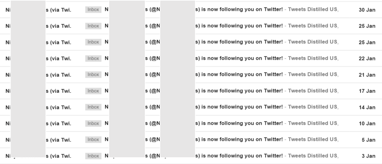
Each time it’s unfollowed and tried again because @Tweetsdistilled didn’t follow it back. Such automated follow spam is a joke. If these are the kind of users Twitter thinks it needs to be serving then it really doesn’t have a future.
At the moment anyone can follow up to 5,000 accounts. You are then limited to following only 10 per cent more accounts than the number that follow you. So to follow more than 5,000 accounts you currently need 4,545 followers.
I’d suggest changing this ratio to substantially less than 1.0x after 5,000 accounts. For example, if set at 0.25x then if you wanted to follow 6,000 (1,000 more) you would need to have 8,545 followers (4,000 more).
I’d also place stricter limits on the number of times you can follow the same account than appears to be the case at the moment. Twice in any 30 day period would be enough to allow for an accidental unfollow!
Combined, these changes would still allow people to grow their followers, but would mean they could only do so if they were interesting to an increasingly large group of users.
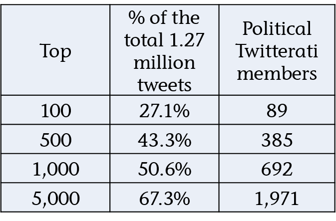
Why do I know these constraints shouldn’t be an issue?
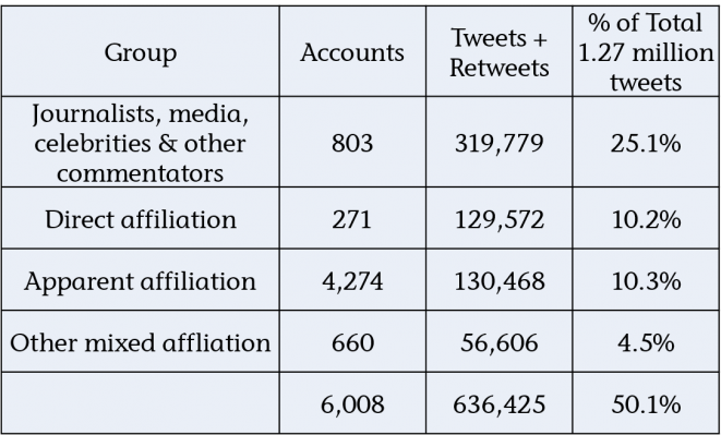
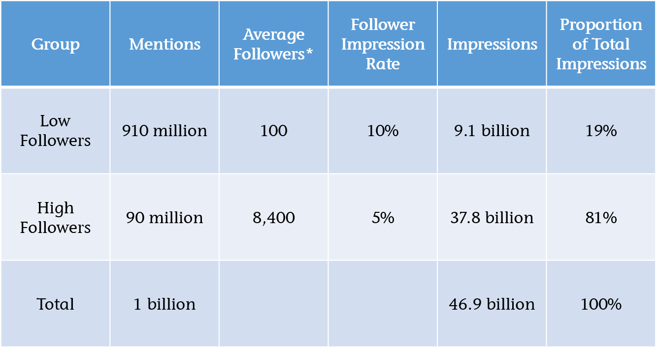
Because of 2.57 million accounts that Lissted has identified as having any real influence potential on Twitter, 95 per cent of them (2.44 million) follow less than 5,000 accounts. Of the remaining 124,000 accounts, 24,000 would still be within the parameters I’ve suggested.
Here’s a table summarising the stats:

You can see the remaining 100,000 accounts have more follow relationships (2.619bn) than the other 2.47 million combined (2.449bn).
And these are just the accounts that Lissted has identified as having some degree of likelihood they are “genuine”. There are probably more that are pure spam that Lissted filters out.
So this tiny minority, less than 0.1 per cent of Twitter users is creating this huge amount of irrelevance.
Communities
A key strength of Twitter is the groups of experts you can find related to pretty much every industry, profession and topic you can think of.
In my opinion Twitter focuses too much on promoting “celebrities” and not enough on these niche communities.
Twitter needs to provide new and existing users with simple and effective ways to “plug into” them.
Inside Twitter
This could be done within the existing feed mechanism. Over the last 12 months our niche Tweetsdistilled accounts e.g. @PoliticsUKTD, @HealthUKTD and @EducationUKTD have been demonstrating this. They’re like a cross between Twitter lists and ‘While you were away’. Having chosen to subscribe to the feed it then posts interesting tweets from the community into your timeline and like Twitter lists you don’t need to be following the specific accounts concerned.
They appear to be doing something right, as they’re followed by many key members of these communities. Even accounts you might assume would have this covered anyway.
Outside Twitter
I’d love to know the engagement stats for the Popular in your Network emails. Does anyone actually look at them? For new users they seem to focus heavily on celebrity tweets. My suspicion is if you wanted to sign up for Stephen Fry’s or Kanye’s tweets you’d have done it by now.
Instead, why not allow users to subscribe to a summary of what communities have been talking about. The content they’ve shared and the tweets they’ve reacted to.
Lissted can now deliver daily and weekly digests of the most interesting content and tweets from an array of communities. Here’s Sunday’s US Business community weekly digest for example.
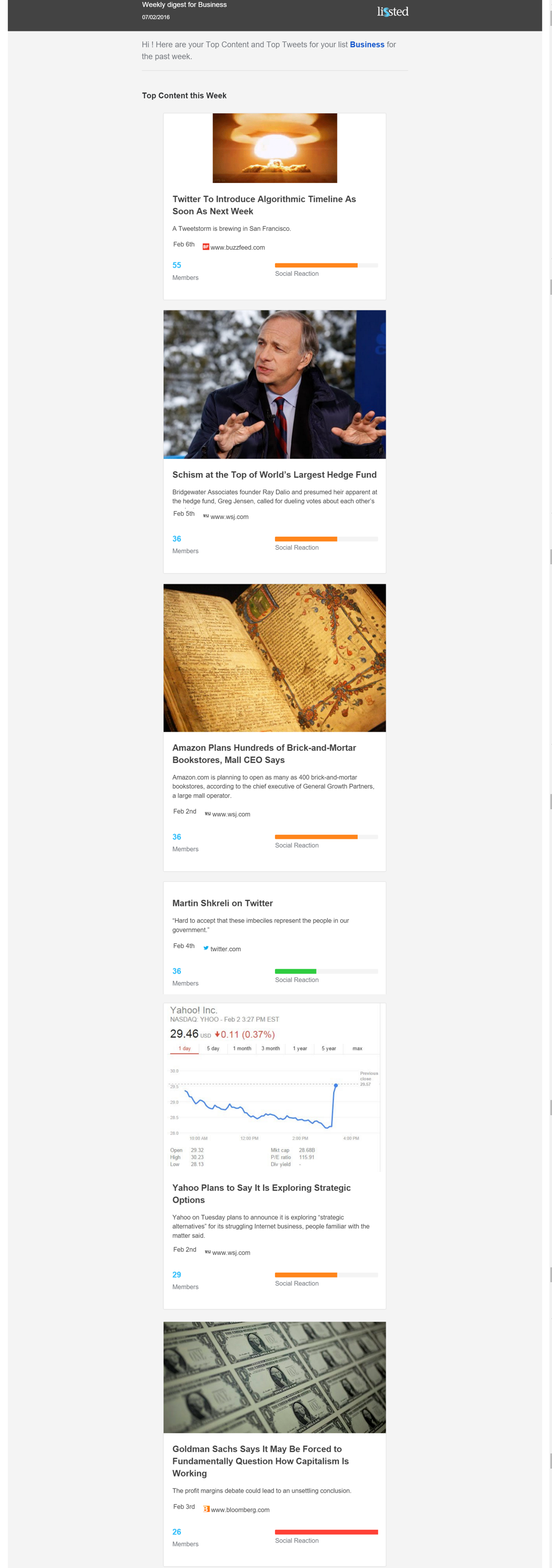
To produce these digests Lissted actually combines the response of a Twitter community with the wider social reaction across Facebook, LinkedIn and Google+. But it still demonstrates Twitter has the ability to be seen as a powerful intelligence tool for new and existing users with minimum investment on their part.
If you have 7 minutes to spare here’s a detailed story we produced last October about how this could also help Twitter in an onboarding context too.
Over to you Jack
Twitter’s next quarterly results announcement is tomorrow (10th February). I wonder if any of these areas will be addressed….
